Kansas City Chiefs
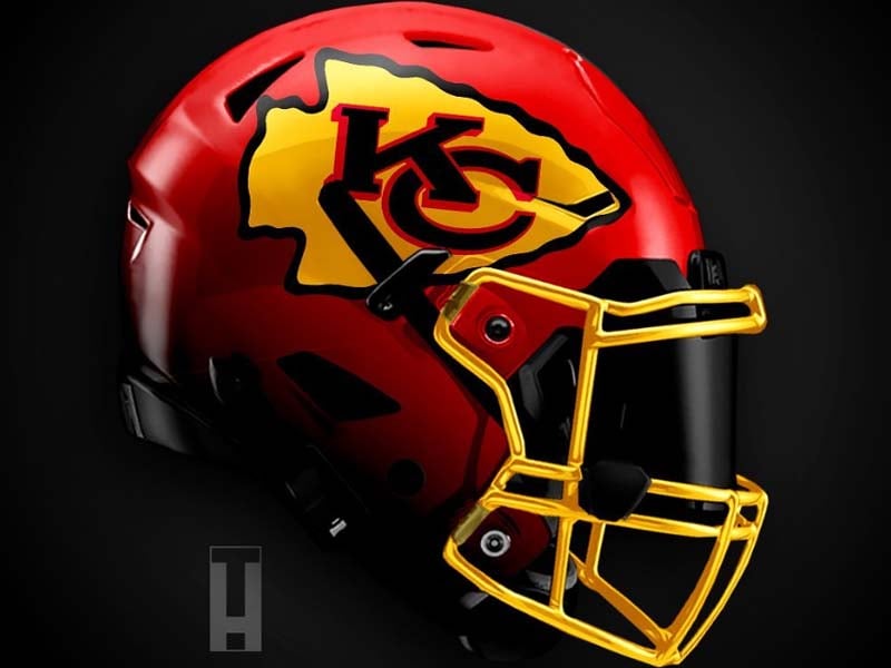
It’s hard to improve on an all-time great. With that in mind, Concept 1 has simply swapped out white with gold. While normally we’d say that it’s a good idea to add more color, in this case, we don’t think so. The gold chrome facemask is startling and doesn’t fit with the rest of the helmet. Grade: C-
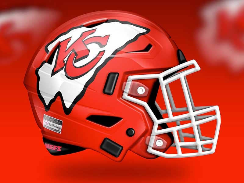
Concept 2 has stuck with the original design with some slight, but damaging changes. What has happened to the Chiefs logo? It looks as if it is a balloon that has come unknotted and is deflating midflight. Or like it’s one of Salvador Dali’s famous melting clocks. Something’s not right here. Grade: C
Advertisement