Green Bay Packers

Here’s another classic that it’s difficult to improve on and not commit sacrilege by updating. Concept 1 goes with their tried and true method of putting some stripes on the bottom of the helmet. It’s not bad, it just looks weird to have the Packers helmet be anything but plain and simple. Grade: C+
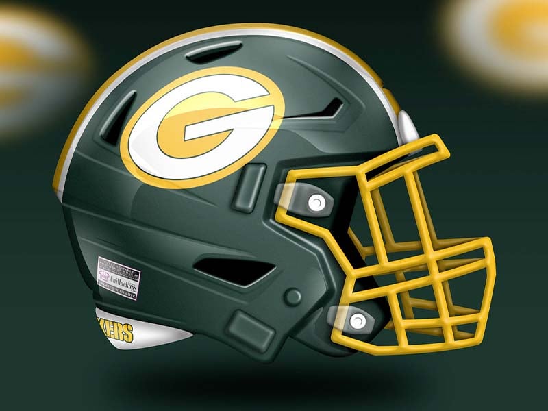
Concept two has simply inverted the colors. Instead of a yellow helmet, we have a green helmet. And actually, it’s quite good. The yellow really pops on the facemask and the logo. We quite like this look. Grade: B+
Advertisement