32. Tampa Bay Buccaneers
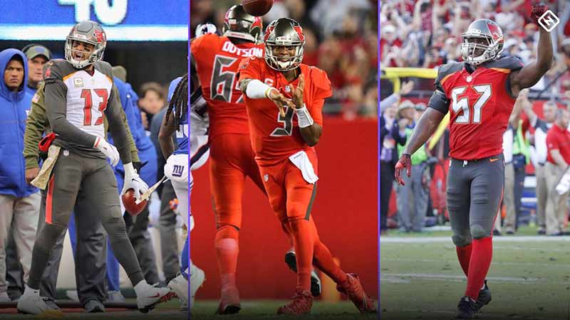
It’s difficult to tell if the Bucs are playing football or trying to tell us what time it is. The digital alarm clock font on Tampa’s uniforms is bad enough by itself to warrant the number 32 spot.
Combine the bad font with oddly placed panels of different colors and you have the worst uniforms in the NFL. It’s a shame really, because they have one of the best helmets in the league.
31. Jacksonville Jaguars

The Jaguars wear simple and unspectacular uniforms. While this might work for a team steeped in NFL lore and history, the Jaguars are just 24 years old and generally without anything to base it’s traditions on.
The team hired Tom Coughlin to give the team an identity on the field, yet they are still making uniform choices that signal they are still looking for a signature aesthetic identity. Fortunately the team bailed on the two-tone helmet design of a few years ago. That was bad.
Continue reading on the next page.