Buffalo Bills: Worst Design
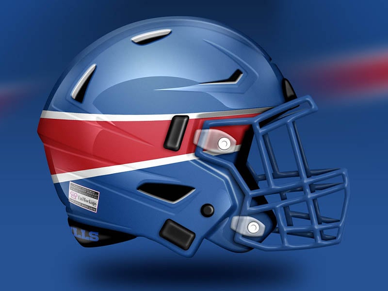
Nope, don’t like it. There’s absolutely nothing to like about this helmet. Members of Bills Mafia might riot if the team actually had to wear this helmet. We can’t even recognize this as being Buffalo’s helmet without the charging buffalo.
This concept has taken the idea of minimalism to an unhealthy level. Sure, that stripe is the stripe coming off the buffalo in the Bills logo, but where’s the buffalo? The buffalo is bringing the energy, hence the stripe. But if he isn’t there, there can be no stripe. It’s all wrong and it makes no sense.
Grade: F
Advertisement