Kansas City Chiefs: Worst Design
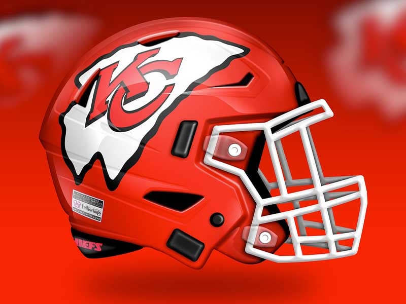
This concept has stuck with the original design with some slight but damaging changes. What has happened to the Chiefs logo? It looks similar but somehow glaringly different, almost as if it is a balloon that has come unknotted and is deflating midflight.
Something just doesn’t look right here. If the Chiefs were going to do something like this, they might as well keep what they currently have. Either do something bold and different or don’t do anything. Subtly gets you nowhere when you already have one of the league’s classic helmets.
Grade: C
Advertisement