Pittsburgh Steelers: Worst Design
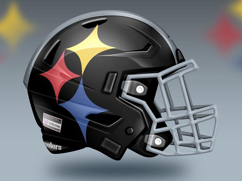
Oh boy. This concept goes hard into the Steelers logo. Sure it’s unique to the Steelers’ identity as it is the logo belonging to the American Iron and Steel Institute, and is known as the Steelmark. But this helmet takes things a little too far.
The problem is without the rest of the logo it looks like the face paint of a court jester. And nobody wants to be a jester. The Steelers are too proud of a franchise and Pittsburgh is too proud of a city to have a helmet like this.
Grade: C
Advertisement