Washington Redskins
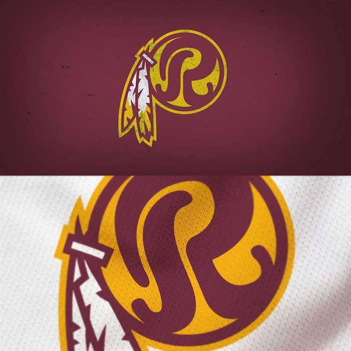
Removing the cartoon Native American from the logo is a start for a franchise stuck in a quagmire over its nickname. The curvy “R” that replaces the head looks retro but fresh. It’s a really great look. The burgundy and gold colors have always looked great together. This is a step in the right direction.
Grade: A-
Advertisement