Washington Commanders
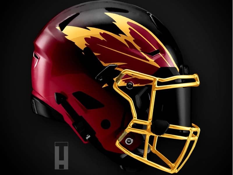
A disclaimer for both of these designs; while the football team in Washington has been renamed, the redesigns were heavily influenced by the old logo and color scheme.
Concept 1 does a nice job of avoiding the actual logo image of the franchise, but yet still is very clear about who the team is. The feathers are placed behind the forehead as they would be on a traditional Native American headdress. There is even an example of a two-tone helmet being done excellently. Grade: B+
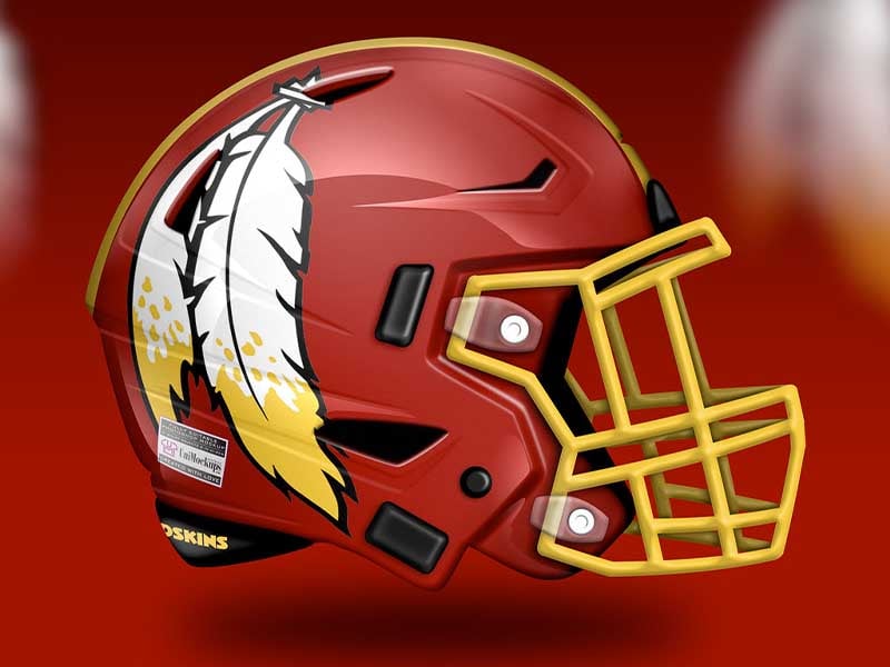
Concept 2 has taken parts of the old logo and put them directly on the helmet. It’s a pretty neat look, albeit a little too cartoony. The yellow facemask really stands out. We wonder what it would look like with a black facemask instead. Grade: B-
Advertisement