Denver Broncos
It seems like every time there is a Broncos helmet update the artist incorporates the light blue from the “Orange Crush” days of the Broncos. What has happened with Concept 1 is a merger of the two helmets. The color scheme is from the “Orange Crush”, but with the modern Broncos logo. It’s ok, but nothing to get too excited about. Grade: C+

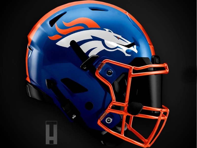
Concept 2 is interesting, but a bit difficult to look at. There’s something about the shade of orange used that’s off-putting. So they’ve obviously tried to show the broncos mane on the side fo the helmet, which could be neat. The execution here is poor, however. Grade: C
Advertisement