30. Los Angeles Clippers
Everyone was glad when Steve Ballmer bought the team and started a rebrand of one of the league’s most forgotten teams. It was an exciting time; Lob City was in its infancy and the Clippers were, for once the better team in the city.
Then came the re-brand. What they release was a knock off EA Sports logo on a pro team uniform. It was bad and remains bad. Now that the Lob City era has made way for the Kawhi/ Paul George era, will we see another re-brand?
29. New Orleans Pelicans

New Orleans is the smallest market in the NBA. When they first acquired their franchise they were using someone else’s nickname, the Hornets. Now they have their own nickname and own identity, but the uniforms just aren’t good.
The Pelicans have one of the most unique nicknames in the league, and one of the most unique color schemes in the league, yet somehow the combination put together for the jerseys just doesn’t work.
Continue reading on the next page.
28. Detroit Pistons

The main problem with the Piston’s jerseys is that they haven’t changed in a long time. Old jerseys are fine if you have a history of success that goes along with them and they generate a sense of nostalgia. The current Pistons set do not evoke any of that.
Luckily for the Pistons, they have a great color scheme to work with. Red, white, and blue make for an easy to appreciate palette, especially in the United States. Detroit has a fine Midwestern basketball history, like the Chicago Bulls, they need a classic look to go along with that.
27. Orlando Magic

This one should be easy. They have a unique color scheme with blue and black. They have a locally relevant identity with the Orlando/Disney connection. They even have a classic throwback look that is cool now. Yet somehow they aren’t getting it right.
Take our advice Orlando; go back to the Penny Hardaway era pinstripes. Don’t get creative with it like these current editions. Once a classic look, always a classic look.
26. Memphis Grizzlies
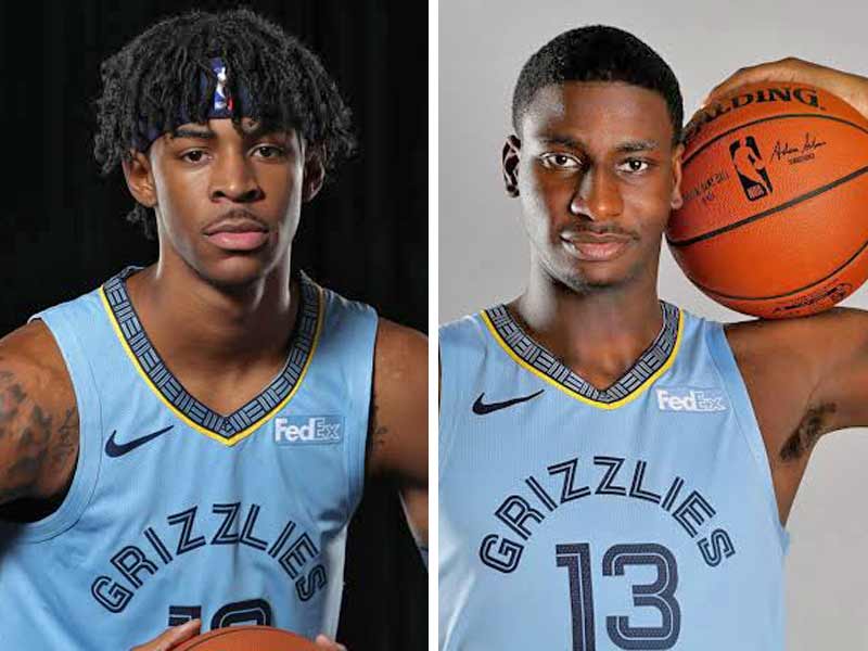
10 years ago this was a great look. It was modern and unique. Now, we’re just over it. The minimalist grizzly logo creeps us out and the color scheme is just weird. Who wears mustard yellow and whatever shade of blue that is?
In the 25 years of existence, the Grizzlies franchise hasn’t settled anywhere, has it? Moved on from Vancouver, and now still finding itself in Memphis. Maybe it’s time for an overhaul of the uniforms on Beale Street.
25. Indiana Pacers
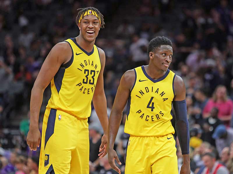
The uniforms of the Indiana Pacers have always been an afterthought in a league that is frequently on the cutting edge of sports aesthetics. Similarly, most people think of Indianapolis as a town in the middle of cornfields and cow pastures, so maybe the uniforms fit.
Recently the Pacers have transitioned into a regular “throwback” style of jersey. That’s great if you re from Indiana and you have a strong relationship for the Pacers, but Paul George saw the writing on the wall and knew that there weren’t many people. Objectively, it’s not a great look. But maybe the people of Indiana like it.
24. Denver Nuggets
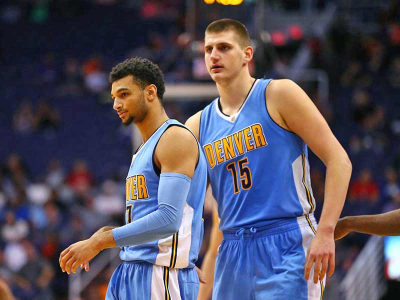
The Nuggets made a grave error when they went away from the Carmelo Anthony era sky blue jerseys; those were some of the best uniforms in league history. We understand the need to change the image as eras change, but is that what had to change?
These new navy-blue and gold unis are ok, but they lack the pizazz that the Carmelo shirts brought. Now that they have some stars of their own, watch Nikola Jokic this season, maybe they’ll create an identity to go with these jerseys.
23. Dallas Mavericks
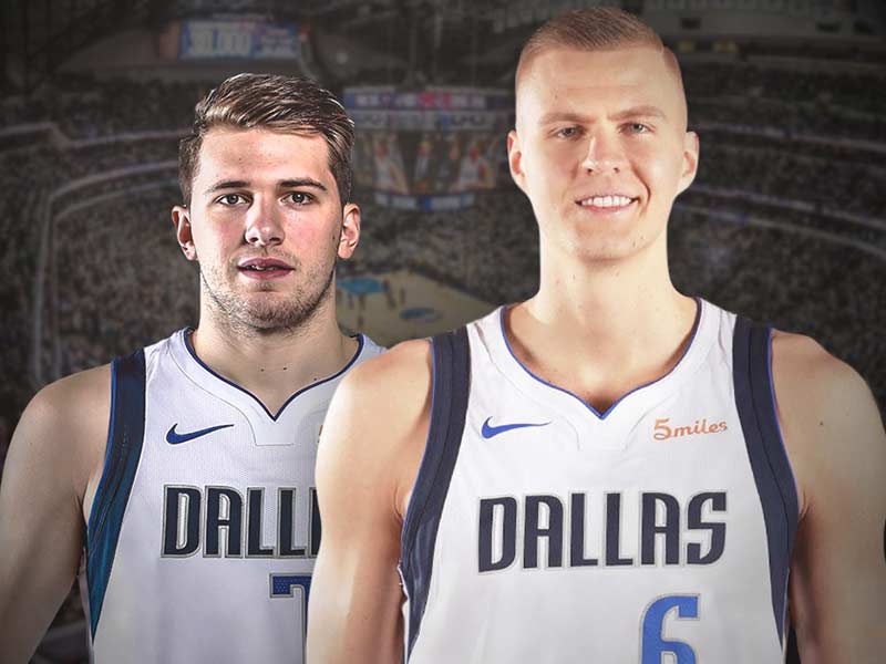
The Mav’s jerseys’ were so good for so long, but now it’s time for a change. For so long the sharp side panels and the clean lines on the Mavericks jerseys represented fast-paced, progressive basketball led by the greatest European export the league has seen, Dirk Nowitzki.
Now that Dirk has retired, the mavericks will be looking for a new identity under the new Euro-star, Luca Doncic. This would be the perfect time to put out new uniforms and re-brand a little. Certainly, businessman owner Mark Cuban understands the benefit of a good re-brand so we will watch and see what happens.
22. Sacramento Kings
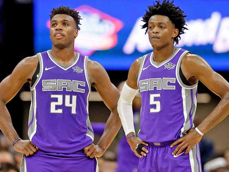
The color scheme and the nickname fit perfectly together, as purple is supposed to be the color of royalty. We like the abbreviation “SAC” on the front. Let’s be honest, Sacramento is too long to fit on the front of a jersey.
We are also big fans of the black and purple alternative jerseys. Black almost always looks good on a uniform, and these are no different. Now, if only the fans in Sacramento had something to cheer about.
21. San Antonio Spurs
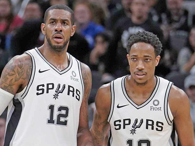
We are torn with the Spurs uniforms. They have a classic look but haven’t been updated in a long time. What has always made the Spurs uniforms so great is that they are simple. The Black and white color scheme is easy to work with, and the Spurs imagery goes with it perfectly.
The designers at Nike just need to update a classic look to bring the jerseys into the 21st century. These jerseys haven’t changed since the days of The Admiral, David Robinson and the early days of Tim Duncan, who is now an assistant of Gregg Popovich’s bench.
20. Utah Jazz
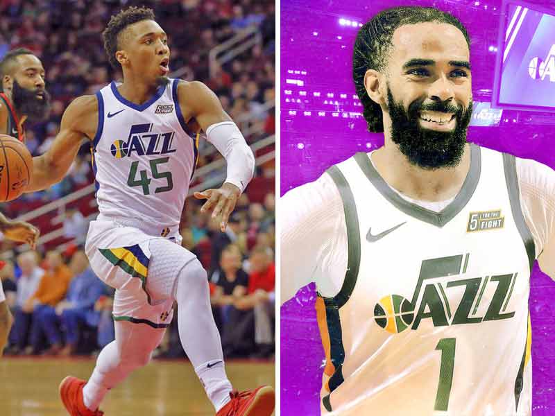
Jazz fans are spoiled for uniform options. Their present look is a throwback look to when the Jazz were originally in New Orleans. This comes through in the Mardi Gras color scheme.
They have a beautiful alternative jersey has includes a gradient that mimics the sunsets in Utah’s national parks. Finally, they have released a beautiful throwback to the Stockton and Malone days that will have every Jazz fan rushing to the team store to pick up.
19. Atlanta Hawks
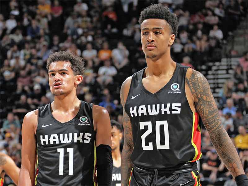
We always appreciate teams trying to change things up and go for it. The Hawks are a franchise that, despite the size of the city, have never really made that much of an impact on the league. Insert the latest edition of the Hawks jersey.
They made an impact on the league, but maybe not a great impact. The Hawks went too far into the future with these jerseys. We like red and yellow; it’s a classic look. But to throw in the safety green? Come on, are they trying to be the Seattle Seahawks?
18. Houston Rockets

We were a fan of the red jerseys with the grey arrows on the side. Now that the Rockets have gone to the solid black panels on the sides, we aren’t as excited. The arrows were a subtle nod to the relationship Houston has to the space industry. Now, that’s gone.
This isn’t the only change Houston fans will have to deal with as they watch how new addition Russell Westbrook adjusts to life in Houston. Will he get along with James Harden? Only time will tell.
17. Minnesota Timberwolves

We are not a fan of the shoulder-paneled jerseys, in any color. We especially don’t like them in the seafoam green that should be saved for “color rush” night in the NFL. The blue’s on the dark uniform are so dark together that it’s hard to tell they are even different.
We will admit that the “City Edition” jerseys are both terrific jerseys and a terrific homage to one of Minnesota’s most famous sons, Prince. They are a home run, and we would never say anything bad about them or Prince.
16. Golden State Warriors
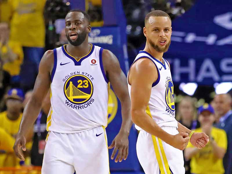
We hate giving the Warriors any credit because they are so smug, but we have to admit they have pretty cool uniforms. One of the cool things about Golden State’s jerseys is that they have an established template but they wear a few variations of it.
For example, the have the classic “Golden Gate” logo in the circle, but they also have the trolley tracks “The Bay” logo, and the tree of life “The City” logo.
15. Toronto Raptors
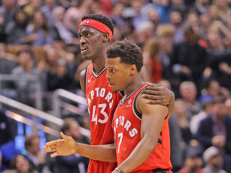
The Raptors just can’t get it wrong right now. They have beautiful red home jerseys, sleek black jerseys and they even have cool “North Edition” red and white jerseys. Then their look gets even better when they pull out the “Jurassic Park” edition throwbacks. You know the ones, purple with a raptor dribbling a basketball on the front. It’s hard to top those.
Not only are they the champs, but they have some of the coolest uniforms in the league. Raptors fans have it all going on right now.
14. Washington Wizards

We are big fans of the horizontal stripes on the Wizards jerseys. Combine the stripes with a red white a blue color scheme that goes perfectly in the nation’s capital, and you’ve got a pretty good uniform.
These uniforms are, of course, inspired by the classic look from decades ago when the team was known as the Bullets. If they couldn’t keep the name, at least they could keep great jerseys. Now, if only the Wizards make a deep run into the playoffs.
13. Milwaukee Bucks

We said we weren’t going to spend much time dwelling on the advertisement patches, but we have to say this one is perfect. What town do you associate Harley Davidson motorcycles with than it’s hometown of Milwaukee, Wisconsin?
These jerseys are also pretty good. We like the updated color scheme and the font used on the jerseys is unique and different. The deer logo is equally impressive and much better than it used to be. Good job Milwaukee!
12. Brooklyn Nets
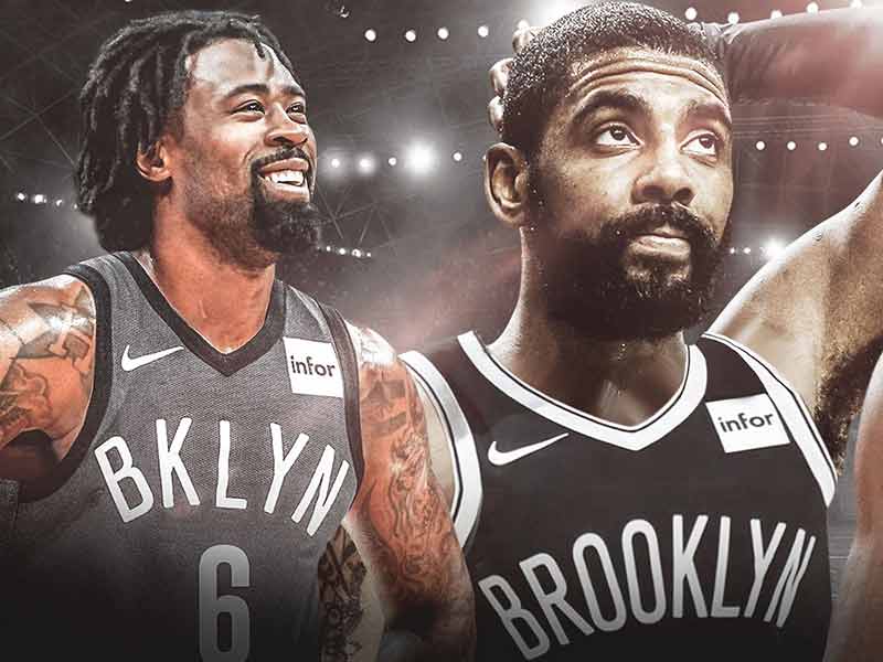
Yes, these are pretty simple jerseys. Black shirts with white print on them. However, somehow they manage to evoke the “concrete jungle” vibe Jay-Z wrote about in his famous ode to New York.
We are not a fan of their new “Statement” jerseys that feature a faux spray-painted wordmark on the front. It seems like a contrived way to add some street style to the shirts. It comes off looking like a child came up with the idea.
11. Cleveland Cavaliers
The Cavaliers have solidified their image in a post-LeBron world with three terrific jerseys. The Wine and Gold have never looked better, even with the small Goodyear logo on the shoulder of the jersey.
Recently, the Cavaliers announced the addition of a throwback black and blue jersey that Cavs fans have been asking for years. The jersey is a throwback to the Shawn Kemp, Darius Miles era of the 90’s and early 2000’s.
10. Philadelphia 76ers
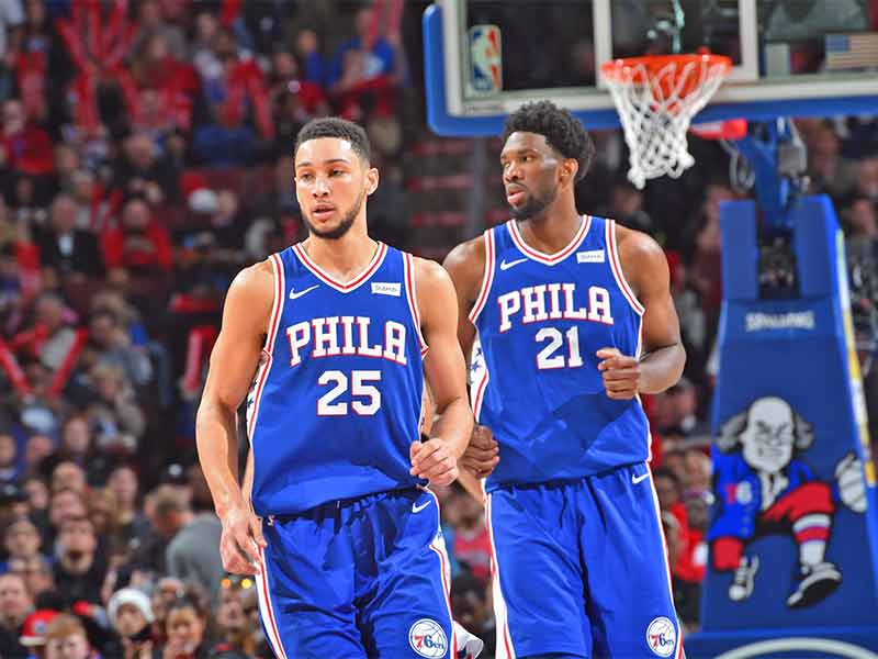
The 76ers are another great example of a brand that took a throwback look and refreshed it to make it look both classic and modern. The imagery of the team evokes the American Revolution and the impact the city had on that time in our nation’s history.
The uniforms do this too, with red, white and blue stars on the sides. The white, blue and grey jerseys are all terrific. We especially love the cream jerseys with the script “Phila” across the front.
9. Phoenix Suns
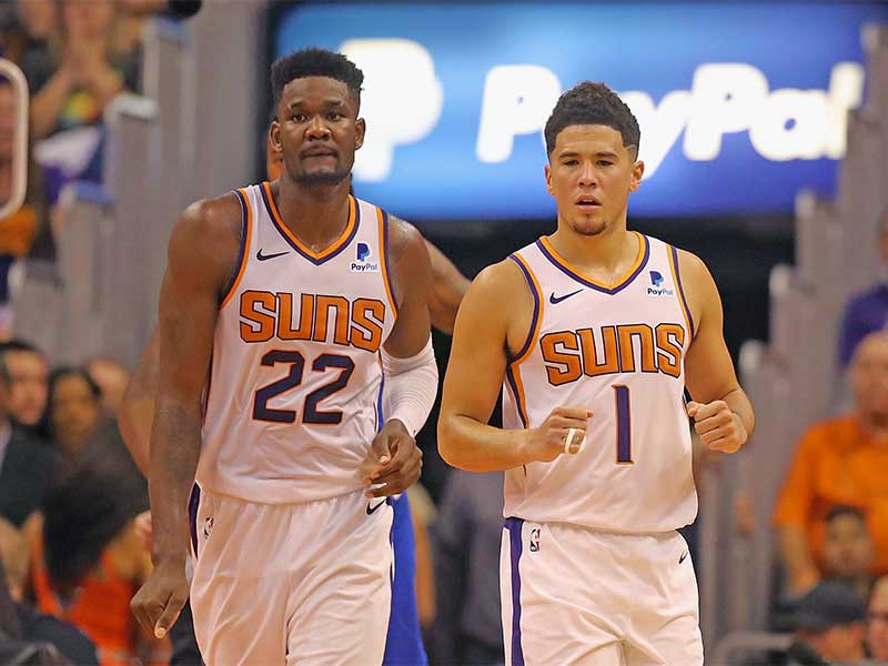
Phoenix is another team with a ton of great options. Phoenix has solid purple and white options as part of their regular rotation. The orange “Swingman” edition is exciting and speaks to the sunny weather in Arizona.
The coup de gras though is black throwback jersey. The look harkens back to the days of Charles Barkley, with the basketball sun logo shooting across the front of the shirt. The Suns should think about going back to that look on a more regular basis.
8. Chicago Bulls
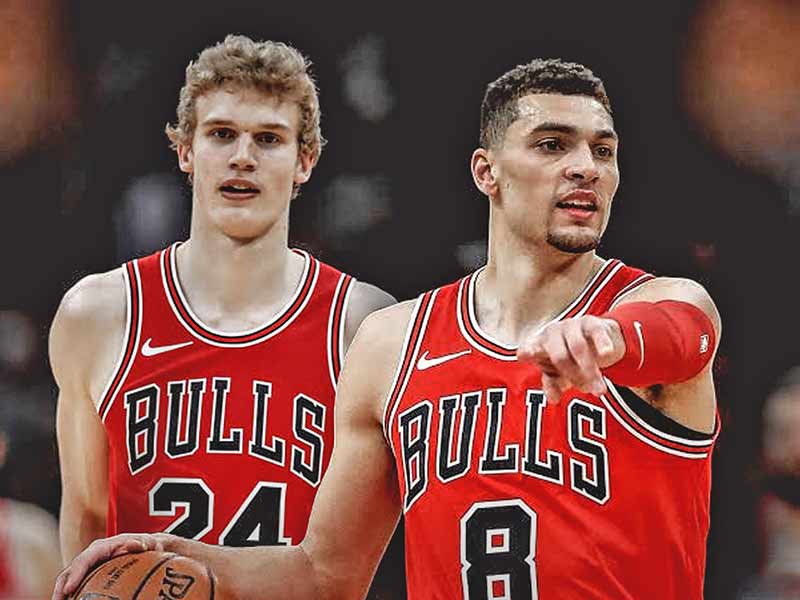
The Bulls are a great example of uniforms that are so good they don’t need updating. Have they changed since the Jordan years? Not really, but for good reason. They are terrific jerseys. We especially love it when they have the bull logo with the nose ring on the shorts.
They are so great there’s not much else to say about them. They have a classic look, with a unique mascot. The Bulls uniforms are perfect for one of the country’s greatest sports towns.
7. Portland Trail Blazers
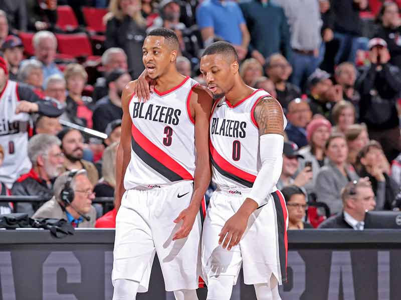
Portland comes in hot with these excellent jerseys. The Rose City club plays in some of the sharpest jerseys in the league. Yes, the black sash across the front does look a little bit like tire tread, but we dig it. The black jerseys with the red and white sash are also sharp.
We love the throwback to the Bill Walton days with the lowercase Blazers print down the side of the jersey. Just another example of how Portlandia is staying ahead of trends.
6. New York Knicks
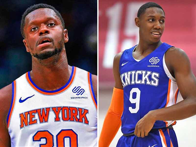
A classic look for one of the league’s most classic franchises. However, this is one example of a great classic uniform that doesn’t have a history of success tied to it. That tells you how good of a look it is.
Hopefully, the Knicks have retired their checkerboard trim jerseys for good. Those were bad when they came out decades ago and were bad when they came back a few years ago. Stick with the classic blue and orange. Did you know that’s a reference to the flag of the City of New York and an homage to the city’s Dutch heritage?
5. Oklahoma City Thunder

The Oklahoma City Thunder have done a terrific job of creating an identity out of nothing since their move from Seattle. They have a bright and vibrant color scheme that allows them to play around with jersey combinations a lot.
We especially like the dark blue “OKC” jerseys with the light blue gradient and the orange “OKC” jerseys with the gradient. Oklahoma City is too long of a name tom put on the whole jersey, so they should just stick to Thunder or OKC on the front.
4. Los Angeles Lakers

The Lakers are a team that gets a lot of credit for classic jerseys because they’ve won a lot. Do the colors purple and gold look particularly good together? No, certainly not. But, when you put them on a jersey and throw the names Johnson, Abdul-Jabbar, and West on the back, the colors shine.
The jerseys were getting a bit stale since the time of Kobe and Shaq, so we were glad to see they updated them with the arrival of LeBron and now Anthony Davis. A class look, refreshed.
3. Miami Heat

The Miami Heat do a few things right with their jerseys. First of all, the Black and red color scheme works perfectly for their nickname, the Heat. What says heat and fire more than red and black? Nailed it.
However, Miami is a way more colorful town than just red and black. So they had a masterstroke and designed their Miami Vice inspired “Miami Nights” jersey. These things scream Miami, with shades of pink and teal dominating. These are the colors a team in Miami should be wearing.
2. Charlotte Hornets

We love the Charlotte Hornets jerseys. The color scheme is unique and lively, and the pinstripes are classic. What we love even more is that the Hornets have embraced their short, but aesthetically pleasing history in their classic uniform set.
No, they don’t have any playing history worth remembering. But at least they have beautiful jerseys to play in. Who knows, maybe Michael Jordan can get this team turned around a competing for titles soon.
1. Boston Celtics
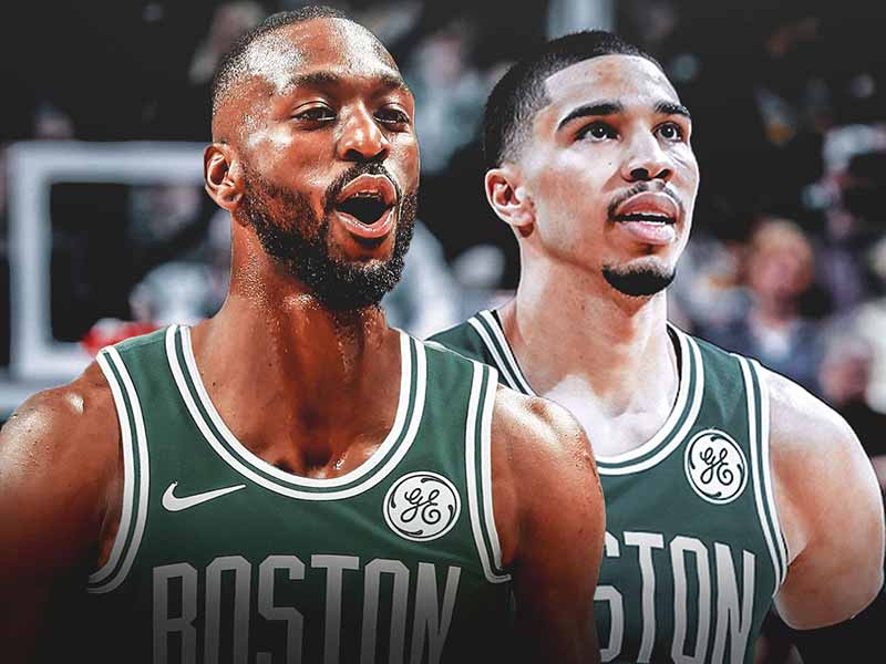
We are suckers for great classic looks. These Celtic jerseys are classic. One look at these and you are transported back in time to the days of Russell and Auerbach. Another look and you jump ahead to the ’80s and Larry Bird and Kevin McHale. Go ahead even further and you’re watching Paul Pierce, Antoine Walker, and Kevin Garnett.
If there were no history to go along with these jerseys would we still rank them so high? Probably not, but because of the history and the titles we can look at the same jersey across generations of winning teams. That’s pretty special.