The NFL has been around for 100 years now and virtually everything about the game has changed. The rule, the equipment, the uniforms. Literally everything. As we look at the NFL today, it’s the biggest professional sports league in the country and most things have changed for the better.
In honor of that, we take a look back at some of the greatest uniforms in NFL history. Because not all change is good, we look at some of the worst uniforms in NFL history as well.
The National Football League’s teams are a rich diversity of organizations. Some are very old and cling to their traditions, and especially uniforms. Think about the Green Bay Packers and Chicago Bears, who haven’t changed much.
Some of the teams are not so beholden to their history or don’t have much history. Those teams change their uniforms all the time, trying to nail down a look that works for them.
Both of those types of clubs are included in this list, some on the good side, and some on the bad. Read what we think, and make some decisions for yourself. You might find you disagree with some of these picks and agree with others. Enjoy!
The Best
15. New Orleans Saints

The Saints helmet and “Color Rush” jerseys get most of the love here, as their regular set of home and away uniforms are pretty bland. Here we have another example of the uniform matching the culture of the city.
The fleur-de-lis design on the gold helmet screams New Orleans French Quarter, while the Color Rush jerseys are so cool they look like they could be a throwback. The shoulder and pant stripes in “Old Gold” hearken back to a day when Archie Manning was slinging it for the Saints.
14. San Francisco 49ers

The San Francisco 49ers uniforms haven’t changed much since the dawn of the franchise, and that’s ok. When Nike took over the NFL’s uniform contract a few years ago they added modern-looking white stripes on the sleeves. They freshened the look up.
The helmet is a classic, although maybe it’s time for an update on a logo that isn’t very discernable on television. Either way, the 49ers have a famous and recognizable look.
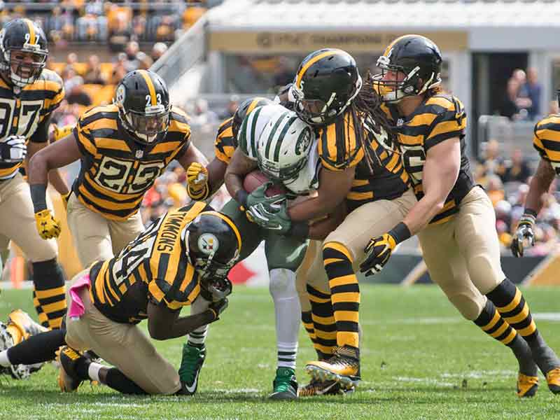
13. Pittsburgh Steelers

Now that the Steelers have ditched their throwback uniforms that looked like a horrific cross between a child’s bumblebee costume and prison uniforms, they can reclaim their place near the top of the uniform list.
There’s nothing flashy about the black and yellow uniforms of the Steelers, and that’s the way it should be in Pittsburgh. They are a hardworking team in a hardworking town, and their uniforms reflect that. Traditional and instantly recognizable, the Steelers have a great uniform.
12. New England Patriots’ “Pat the Patriot”

No, we’re not talking about the “Flying Elvis” logo that the Pats have been wearing since the Parcells era in the early 1990’s. We’re talking about the Patriot who looks ready to snap a football. Those helmets were awesome.
They were complemented by red white and blue uniforms that featured massive shoulder stripes. They looked like Revolutionary War uniforms. Epic. While the Patriots did update their uniforms this off-season, they failed to include a return of Patriot Pat. Come on, guys.
11. Denver Broncos “Orange Crush”
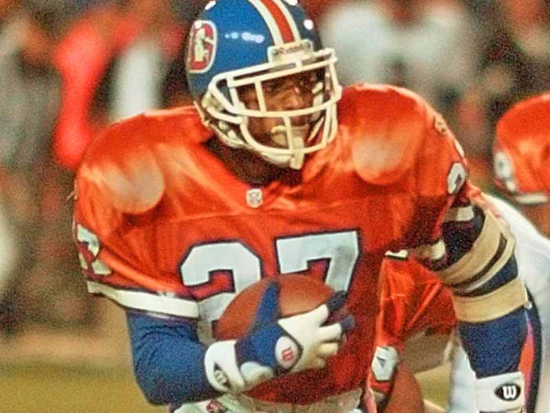
Orange is a great color for football uniforms, and the proof of that is in the Broncos “Orange Crush” jerseys of yesteryear. Orange jerseys and blue helmets with a bucking white horse inside a “D.” Whoever designed that uniform is a genius.
We’re a bit tired of the current Broncos set, so if the designers at Nike are looking to update the uniforms at all they should look no further than the classic “Orange Crush.”
10. Philadelphia Eagles “Kelly Green”
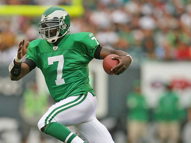
Just about every year since the Eagles went to their current “midnight green” look the Eagles fan base has been asking when the franchise is going to go back to the classic “Kelly Green” look. It’s going to be tough to go back to the old look now that the team has lifted a Lombardi Trophy in the new jerseys, but the franchise is looking into it.
They haven’t worn the “Kelly Green’s” as throwbacks since 2010 because of the league’s rule on wearing only one helmet per season, so we may not see them again for a while.
9. Cleveland Browns classics

The Browns are a team steeped in history, and their simple and classic look reflects that. Apart from the 2015-2019 disaster, the Browns have had pretty much the same look for decades. Brown or white uniforms with orange, brown, and white stripes on the sleeves.
Some think the Browns uniforms and plain orange helmet are boring, but ask any Browns fan and they will disagree. With nothing to write home about recently, all the Browns have is their history, and it starts with their history. Thankfully the Browns have gone back to that look.
8. Kansas City Chiefs

Tradition is king with the Chiefs uniforms, as they have not changed since the team’s inception in the ’60s. The red and yellow combination is subtle enough not to look like ketchup and mustard, and the helmet design is simple and classic.
Fun fact: the Chiefs were the first to wear white face-masks when the rest of the league was wearing grey. So much for being bearers of tradition.
7. Los Angeles Rams
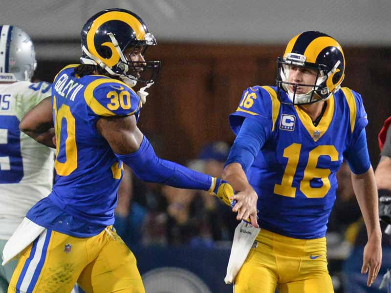
The Rams finally unveiled their new uniforms recently, after years of flip-flopping through color palates on the same template. But with a new stadium to move into in the fall they finally settled on a design.
The helmet is a modern take on the classic Rams helmet, and it’s perfect. The uniforms are good too, with one exception: the numbers. To start, the font looks like something you’d find in a kid’s coloring book. Also, the yellow to white gradient on the blue jerseys just looks out of place. Other than that it’s a great uniform.
6. Chicago Bears
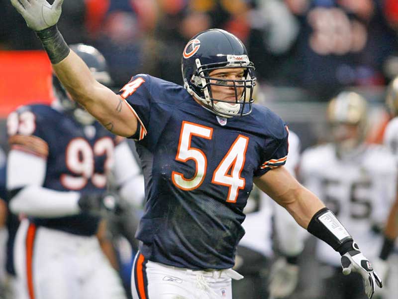
The uniform is old, classic, and similar to many others. What makes this a good uniform though, is the color scheme. The orange and blue combination is a classy look that gives the legacy of the Bears a bit more gravitas.
The Bears lose points for having the same “C” logo on their helmets as the Cincinnati Reds but gain points for the angry bear logo that is just plain cool. All in all, it’s a pretty good uniform for the Monsters of the Midway.
5. Green Bay Packers

Vince Lombardi commissioned the present Packer uniforms when he took over the team in 1959, and they have stayed the same ever since. And why change?
The team has an iconic look that is associated with what is good and wholesome about the NFL, a fan-owned club in the smallest market in American professional sports. Also, they figured out how to make those shades of green and yellow look good together. Why risk it not going so well with a makeover?
4. Dallas Cowboys

There is no more iconic uniform than that of the Dallas Cowboys. The silver helmet with the blue star is known throughout the world. Through the eras of Staubach, Aikman, Romo, and now Prescott, that helmet has meant success, toughness, and star power.
Though the uniform has changed slightly over the years, the pattern has remained generally the same: white uniforms at home, and blue on the road. This is contrary to the unofficial league policy of team colors at home and white on the road, but who are we to tell Jerry Jones to mess with tradition?
3. Indianapolis Colts

You know a uniform is good when multiple teams in multiple cities use it. In the case of the Colts, it’s the same uniform and the same franchise but different towns. The uniform is so good the Colts were wearing it 60 years ago in Baltimore as the Baltimore Colts.
Sure, Indianapolis isn’t a horse town but you’d have a hard time finding a household in Indy that doesn’t have a horseshoe somewhere in it. That’s due to the classic Colts helmet, the white helmet with a blue horseshoe logo on it.
2. Raiders’ “Silver and Black”

One of the best things about the Oakland Raiders aesthetic is that it matches the culture of the fans of the team. Could you imagine what “The Black Hole” fan section in Oakland would look like if the team’s colors were say, orange or red?
No, it wouldn’t work and it wouldn’t have allowed authentic fan culture to spring up. Also, what is sharper than a black uniform and silver helmet? Here’s hoping they don’t mess with the uniforms when they move to Las Vegas.
1. Chargers’ “Powder Blue”

The Chargers powder blue uniforms are the best uniforms in all of American professional sports. These uniforms were originally rolled out for the Chargers’ inaugural 1960 season and resurfaced in recent years when the throwback jersey craze took hold.
Good news for Charger fans and jersey lovers of all kinds, the Chargers announced that those powder blues would be the primary home jersey for the team in the 2019 season. They have been updated and modernized, and are hands down the best NFL jerseys you will see on the field this year.
Now let’s take a look at the worst of the worst…click the Next button below to continue reading.
The Worst
15. Washington Redskins

The Redskins need a complete overhaul of everything; logo, mascot, nickname, etc. Until that happens, the Redskins will remain on most “Worst” lists around the internet. Aside from the controversy surrounding the imagery, the uniforms actually aren’t that bad.
The Redskins have one of the best color schemes in the league and have put together a simple and classy uniform set. Except for the “Florida State North” experiment a decade or so ago, the Redskins have pretty much kept the look the same.
14. Baltimore Ravens’ Mustard Pants

The Ravens have pretty good uniforms. The club has used the purple and black combination very effectively. It’s a really sleek look. The Helmet could use some updating, but that’s not what we’re here to complain about.
It’s the mustard pants we don’t like. The organization tried so splash some color on some otherwise dark uniforms with these hideous mustard pants. The mustard colors as a jersey accent, fine. But not as pants. It looks terrible.
13. Tennessee Titans

Tennessee recently rolled out new uniforms after more than a decade with its first uniform design as the Titans. To be honest, it’s a downgrade.
They used to have one of the coolest helmets in the league, but they made it dull. They used to have one of the most innovative uniforms, but they tried to improve it. Instead, they ended up with a poor imitation. A two-tone spearhead on the shoulder pads? In mythology, Titans are a race of gods. What would they even need spears for?
12. Minnesota Vikings’ 2006-2012 uniforms

The Vikings tried very hard to update their classic look in 2006. They tried to modernize the Viking horn on the sleeve but took it too far. The panels along the ribcage were no good and the sleeve horn was too chunky.
Fortunately, their uniforms got a massive upgrade in 2013 and immediately became one of the best-looking uniforms in the league. They got the modern upgrade that they should have received 7 years earlier.
11. Detroit Lions’ all-grey uniforms

The Lions wear the classic “Honolulu Blue” uniforms and look great. They wear the white uniforms trimmed in “Honolulu Blue” they look great. But when they wear the all grey “Color Rush” uniforms they look awful.
Contrasted with the shiny silver helmets the grey jerseys just look dull and unremarkable. It’s a shame really, as the silver and blue hearken to Detroit’s automotive past and present. Why tarnish that with a dull grey?
10. Cincinnati Bengals current uniforms

This is a tough one. The helmet is so good, but the rest of the uniform is just average. The tiger stripes are such an easy thing to get right, but yet the Bengals designers have managed to over complicate it.
With a simpler away uniform, this would be a top 10 look, but the orange panel on top of the shoulders is a strange look. When they redesign these they should look to the past for some quality options.
9. Pittsburgh Steelers’ 1933 throwbacks
No, we’re not talking about the “Bumblebee” jerseys, but those are terrible too. We’re talking about jerseys the Steelers who in 1994 to honor the 75th Anniversary of the NFL. These monstrosities were a modern take on that bumblebee design.
They took a terrible design and made it worse though. Smack dab in the middle of the shirt they stuck the Pittsburgh city seal. These jerseys were just a mess. Black bars going everwhich way, including on top of the shoulder. The original Steelers knew it was a bad idea because they phased out the design in 1934, just one year after using them for the first time.
8. Seattle Seahawks’ lime green jerseys

The Seattle Seahawks shook the uniform game up when they updated their uniforms in 2012. They stunned the league by introducing interesting patterns and textures that reflected the culture of the Pacific Northwest. The uniforms are excellent, all except one.
The Seahawks lime green color rush jerseys are an abomination that should be sent to the depths of the Puget Sound. The color works perfectly as an accent on their jerseys, but on the whole thing? No thanks. Wasabi on sushi is nice, but do I want a whole plate of wasabi? No, I do not.
7. Denver Broncos’ AFL throwbacks

In 2009, the Denver Broncos celebrated the 50th Anniversary of the AFL. Why the needed to celebrate the inauguration of a league that was absorbed by another league is a question for a different article. But the way the Broncos chose to honor the defunct league led many to wonder why the league didn’t fold earlier.
The jerseys were hideous. Plain white shirts with brown and yellow socks. But the worst part of the whole look was the vertically striped black and white socks, which didn’t match in any way the stripes on the pants. What an eyesore.
6. Tampa Bay’s 2014-2019 uniforms

It’s difficult to tell if the Bucs are playing football or trying to tell us what time it is. The digital alarm clock font on Tampa’s uniforms is bad enough by itself to warrant the number 32 spot.
Combine the bad font with oddly placed panels of different colors and you have the worst uniforms in the NFL. It’s a shame really because they have one of the best helmets in the league. Tampa just got updated uniforms for the upcoming season, so we won’t have to see Brady and Gronk in these atrocities.
5. Miami Dolphins’ current uniforms

The Dolphins should have one of the best uniforms in the league year in and year out. In fact, they do but they hardly ever wear it. We’re talking about the throwbacks with the orange and white sleeve stripes. Those are excellent, the current uniforms pale in comparison to the throwbacks.
The Dolphins’ current uniforms are absurdly plain, featuring no elements of design to speak of. They even downgraded the helmet, to include a helmetless dolphin. It’s one of the coolest logos in sports and they ruined it.
4. Denver Broncos’ current uniforms.

The Broncos haven’t changed their uniforms since the late 90’s when John Elway took them to back-to-back Super Bowl wins, but it’s time for an upgrade. The look is uniquely Denver, but there has to be some way to update a look that is over 20 years old.
One way to make Denver’s uniform set better is if they included more of the throwback, “Orange Crush” uniforms. The orange and blue together is such a great look. We need more of it.
3. Jacksonville Jaguars’ Color Rush

The Jags just can’t seem to get their uniform situation figured out. They’ve got a unique color palette to work with, but just keep getting it wrong. First, there was the two-tone helmet. Thankfully they got rid of that. Then the mustard-colored “Color Rush” jersey came out.
Did they learn nothing from the Ravens pants debacle? If mustard pants are bad, an entire uniform that color is worse. Hopefully one day they can get things figured out for the Duuuval faithful.
2. Carolina Panthers’ teal jerseys

The Carolina Panthers haven’t changed up the jersey much since they entered the league in 1995. If it’s not broke, don’t fix it. Well, one of them is broke, the all-teal jersey. Carolina has a uniquely “Carolina” color palette highlighted by teal. It’s not quite “Carolina blue” but it’s close.
The problem is it’s just too much teal when it’s the whole jersey. It looks great as an accent color, not so much as the full thing. Honestly, it’s probably time for the Panthers to do a uniform overhaul anyway. Their fans deserve it.
1. Philadelphia Eagles 1934 throwbacks

Thankfully these jerseys have only been worn once this century because they are horrendous. The Eagles wore these jerseys in 2007, to commemorate the club’s 75th anniversary season. It’s difficult to put into words how ugly these things were.
They combined two colors that should never be put together again and featured the weirdest version of the “winged” helmet you’ve ever seen. They are like if the Michigan Wolverines helmet had forgotten to eat it’s Wheaties. Just bizarre. Hopefully, they will keep these in the closet when the 100th anniversary rolls around.