32. Tampa Bay Buccaneers
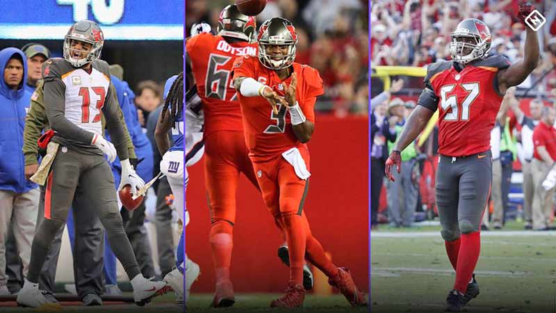
It’s difficult to tell if the Bucs are playing football or trying to tell us what time it is. The digital alarm clock font on Tampa’s uniforms is bad enough by itself to warrant the number 32 spot.
Combine the bad font with oddly placed panels of different colors and you have the worst uniforms in the NFL. It’s a shame really, because they have one of the best helmets in the league.
31. Jacksonville Jaguars

The Jaguars wear simple and unspectacular uniforms. While this might work for a team steeped in NFL lore and history, the Jaguars are just 24 years old and generally without anything to base it’s traditions on.
The team hired Tom Coughlin to give the team an identity on the field, yet they are still making uniform choices that signal they are still looking for a signature aesthetic identity. Fortunately the team bailed on the two-tone helmet design of a few years ago. That was bad.
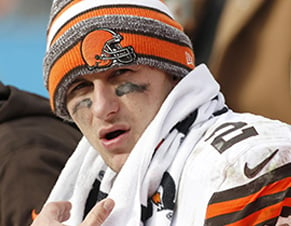
30. Cleveland Browns

When Dee and Jimmy Haslam took over the Browns they decided their new team needed a new uniform design. Instead of looking to the past for inspiration, they tried to push this team into the future.
The design they came up with was horrific. Shoulder stripes that continued onto the chest, and the giant team name on the pants where stripe should have been; the redesign was almost as disastrous as the Browns play on the field since the Haslam’s took over. Fortunately Browns fans have been promised a simpler, more traditional redesign in 2020.
29. Tennessee Titans

Tennessee recently rolled out new uniforms after more than a decade with their first uniform design as the Titans. To be honest, it’s a downgrade.
They used to have one of the coolest helmets in the league, but they made it dull. They used to have one of the most innovative uniforms, but they tried to improve it. Instead they ended up with a poor imitation. A two tone spearhead on the shoulder pads? Titans in mythology are a race of gods. What would they even need spears for?
28. Arizona Cardinals

The Cardinals have a logo that has been copied by high schools all over the country. And for good reason, it’s a really sleek logo. However, the uniforms are a different story.
All three uniforms have inexplicable stitching going every which way for on apparent reason other than to give the uniform something interesting on it. Well, that isn’t good enough. Simplify the classic red, white and black jerseys and you could have a really sharp look.
27. Buffalo Bills

The Bills used to have the worst uniforms in the history of the NFL, but they got smart and went to the “fauxback” look.
Inspired by the Bills look in the 90’s when they lost four straight Super Bowls (sorry Bills fans), the Bills are playing in sharp, sleek jerseys that would make Jim Kelly jealous. The look is only improved when they wear the all red buffalos on their helmets instead of the charging buffalo. It really completes the retro look.
26. New England Patriots

The last time the Patriots changed uniforms was the season that Tom Brady took over for Drew Bledsoe and changed the NFL forever. Likely, the Patriots won’t change uniforms again until Brady retires.
That said, the uniforms they have are fine, but unspectacular. We’d like to see a return of the original Pat Patriot logo. At the very least we’d like to see a return to the original colors of red, white and blue.
25. New York Jets

The newest uniform in the NFL catalogue, New York’s second NFL team debuts their redesigned jerseys this season and they just don’t hit the mark.
Unfortunately for Jets fans, the new jerseys look like a low-level college football jersey. Nothing about the uniforms speaks to the history or culture of the Jets franchise. While the logo received a modern upgrade, it doesn’t look good on the helmet. Once again, the Jets will be a second thought in the New York market.
24. Baltimore Ravens

Purple is a great color for sports uniforms when a team wants to stand out. However, when your accent color is black, you end up with really dark uniforms. In this case, the uniforms are too dark.
Typically when teams have dark colors they accent them with brighter, lighter colors. For example the Saints accent their black uniforms with gold. If the Ravens wanted to improve these, they’d be wise to do the same.
23. New York Giants

Giants fans will likely see a changing of the guard this season at quarterback, and it’s probably time to see a change in uniforms. The Giants have been wearing the current edition of their uniforms since the early 2000’s.
While they’ve never had a really flashy design, the Giants could do with a modern upgrade of their plain, one colored uniforms. What better time to do so than when passing the torch from one quarterback to another?
22. Houston Texans

The Texans logo saves this combination from a lower rating. The uniforms are nothing to write home about, but the two-tone logo of a Texas longhorn brings grit and flash to the helmet.
The Texans have the distinction of being the youngest franchise in the NFL and do not have a long history or tradition to rely on. Combine this with an uninspired color scheme and there’s not really much going on here.
21. Atlanta Falcons

Sometimes it’s easy to design one part of the uniform and really difficult to design the other part. This is the case with the Falcons who have a terrific helmet, the minimalistic falcon outline, but the overly complicated uniform with too many colors on the sleeves.
However, the Falcons knock it out of the park when they put on the “Dirty Bird” era throwbacks; all black with white pants. See uniform designers of the world, it isn’t that hard.
20. San Francisco 49ers

The 49ers updated their classic look when Nike took over the NFL contract by going with simpler white sleeve stripes. However, it makes us wonder if they could have gone a little further with the rest of the uniform.
Yes, the 49ers helmet is iconic, but it’s been the same since 1962. What’s more, are we sure it’s even that good of a design? Well the people of the Bay Area don’t seem to be complaining, so we will. Update the look for goodness sakes!
19. Chicago Bears

The uniform is old, classic, and similar to many others. What makes this a good uniform though, is the color scheme. The orange and blue combination is a classy look that gives the legacy of the Bears a bit more gravitas.
They Bears lose points for having the same “C” logo on their helmets as the Cincinnati Reds, but gain points for the angry bear logo that is just plain cool. All in all, it’s a pretty good uniform for the Monsters of the Midway.
18. Carolina Panthers

Sports teams in North Carolina are known for wearing distinctive shades of blue and the Panthers are no exceptions to this. With one of the most unique color schemes in the league, the Panthers stand out.
With that said, the uniform has stayed basically unchanged since 1995 when the team entered the league. It would be nice to see the team shake up the design and do something different as the Panthers enter a new decade in 2020. They’ve got such a great palate to work with.
17. Los Angeles Rams

The Rams would be higher on this list if they could figure out one color scheme to work with. They flip-flop between blue and white, and blue and gold, sometimes wearing blue and gold uniforms with blue and white helmets, and vice versa. What?!?
LA, city of style and glamour, make up your mind. Both are good looks, but please just choose one. Hopefully they will have figured out what they’re doing by the time they move into their new home in 2020.
16. Cincinnati Bengals

This is a tough one. The helmet is so good, but the rest of the uniform are just average. The tiger stripes are such an easy thing to get right, but yet the Bengals designers have managed to over complicate it.
With a simpler away uniform this would definitely be a top 10 look, but the orange panel on top of the shoulders is a strange look. When they redesign these they should look to the past for some quality options.
15. Detroit Lions

The Lions wear the classic “Honolulu Blue” uniforms and look great. They wear the white uniforms trimmed in “Honolulu Blue” they look great. But when they wear the all grey “Color Rush” uniforms they look awful.
Contrasted with the shiny silver helmets the grey jerseys just look dull and unremarkable. It’s a shame really, as the silver and blue hearken to Detroit’s automotive past and present. Why tarnish that with a dull grey?
14. Indianapolis Colts

You know a uniform is good when multiple teams in multiple cities use it. In the case of the Colts, it’s the same uniform and the same franchise but different towns. The uniform is so good the Colts were wearing it 60 years ago in Baltimore as the Baltimore Colts.
Sure, Indianapolis isn’t a horse town but you’d have a hard time finding a household in Indy that doesn’t have a horseshoe somewhere in it. That’s due to the classic Colts helmet, the white helmet with a blue horseshoe logo on it.
13. Washington Redskins

Despite having the most controversial nickname in all professional sports, Washington has the best color scheme. The burgundy and gold combination is classy and enduring.
When the colors are good, you don’t have to get to creative to make a good uniform. Fortunately, the Redskins they haven’t over thought it. A simple burgundy uniform, and yellow pants with stripes. They played around with arrowhead imagery in the Steve Spurrier era, but correctly went back to the classic Washington uniform.
12. Miami Dolphins

Wouldn’t you expect the team in Miami to have a uniform that reflects the colorful culture of Miami? Well the logo and the team colors certainly reflect Miami, but the uniforms lack a certain pizzazz.
Don’t get us wrong, they have a color scheme that is attractive and unique to South Beach, but the jerseys are simple. We do like the updated helmet design that the Dolphins have been working with for the last few seasons.
11. Philadelphia Eagles

The Eagles have been rolling with the same jerseys since the late 90s. Some would say it’s time for an upgrade. Others would say don’t mess with success.
Since the Eagles have been wearing the “midnight green” uniforms made popular by Donovan McNabb, they have experienced unmatched success in their franchise’s history playing in two Super Bowls and winning one. However they need to put the “Kelly green” throwbacks back into the permanent rotation.
10. Kansas City Chiefs
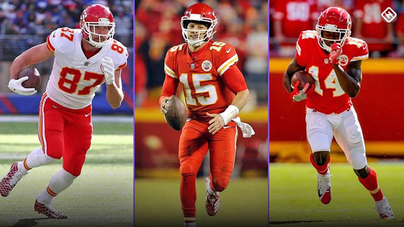
Tradition is king with the Chiefs uniforms, as they have not changed since the team’s inception in the 60’s. The red and yellow combination is subtle enough not to look like ketchup and mustard, and the helmet design is simple and classic.
Fun fact: the Chiefs were the first to wear white facemasks, when the rest of the league was wearing grey. So much for being bearers of tradition.
9. Denver Broncos

The Broncos haven’t changed their uniforms since the late 90’s when John Elway took them to back-to-back Super Bowl wins, and why should they? The armpit and pant striping is uniquely Denver, and that angry Bronco on the helmet is fierce.
The only way to make Denver’s uniform set better is if they included more of the throwback, “Orange Crush” uniforms. The orange and blue together is such a great look. We need more of it.
8. New Orleans Saints

The Saints helmet and “Color Rush” jerseys get most of the love here, as their regular set of home and away uniforms are pretty bland. Here we have another example of the uniform matching the culture of the city.
The fleur-de-lis design on the gold helmet screams New Orleans French Quarter, while the Color Rush jerseys are so cool they look like they could be a throwback. The shoulder and pant stripes in “Old Gold” hearken back to a day when Archie Manning was slinging it for the Saints.
7. Minnesota Vikings

When the Vikings modernized their uniforms recently they got it just right. They didn’t change what made the brand popular; they just updated it a little.
The matte helmets are unique to the NFL, but still carry the horn logo. The uniforms are still bright purple but they updated the font and the stripes. The Vikings should get all the credit it possible for a perfect brand update.
6. Seattle Seahawks

The Seattle Seahawks are an example of how modern uniform designs can really work in the NFL. Launched in 2012 when Nike took over the NFL uniform contract, Seattle has really separated themselves from everyone else in the uniform game.
Their uniforms feature a modern design that is most noticeable with the “feather” design on the helmets and pants, as well as the “Action Green” accent color that sometimes even shows up as the main jersey and pant color on the “Color Rush” uniforms. Seattle definitely went bold with their redesign and it paid off.
5. Oakland Raiders

One of the best things about the Oakland Raiders aesthetic is that it matches the culture of the fans of the team. Could you imagine what “The Black Hole” fan section in Oakland would look like if the team’s colors were say, orange or red?
No, it wouldn’t work and it wouldn’t have allowed an authentic fan culture to spring up. Also, what is sharper than a black uniform and silver helmet? Here’s hoping they don’t mess with the uniforms when they move to Las Vegas.
4. Green Bay Packers

Vince Lombardi commissioned the present Packer uniforms when he took over the team in 1959, and they have stayed the same ever since. And why change?
The team has an iconic look that is associated with what is good and wholesome about the NFL, a fan owned club in the smallest market in American professional sports. Also, they figured out how to make those shades of green and yellow look good together. Why risk it not going so well with a makeover?
3. Pittsburgh Steelers
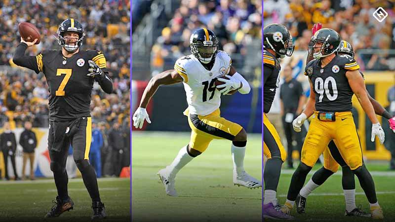
Now that the Steelers have ditched their throwback uniforms that looked like a horrific cross between a child’s bumblebee costume and prison uniforms, they can reclaim their place near the top of the uniform list.
There’s nothing flashy about the black and yellow uniforms of the Steelers, and that’s the way it should be in Pittsburgh. They are a hard working team in a hard working town, and their uniforms reflect that. Traditional and instantly recognizable, the Steelers have a great uniform.
2. Dallas Cowboys
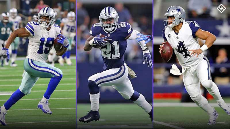
There is no more iconic uniform than that of the Dallas Cowboys. The silver helmet with the blue star is known throughout the world. Through the eras of Staubach, Aikman, Romo, and now Prescott, that helmet has meant success, toughness, and star power.
Though the uniform has changed slightly over the years, pattern has remained generally the same: white uniforms at home, and blue on the road. This is contrary to the unofficial league policy of team colors at home and white on the road, but who are we to tell Jerry Jones to mess with tradition?
1. Los Angeles Chargers

The Chargers powder blue uniforms are the best uniforms in all of American professional sports. These uniforms were originally rolled out for the Chargers inaugural 1960 season and resurfaced in recent years when the throwback jersey craze took hold.
Good news for Charger fans and jersey lovers of all kinds, the Chargers announced that those powder blues would be the primary home jersey for the team in the 2019 season. They have been updated and modernized, and are hands down the best NFL jerseys you will see on the field this year.