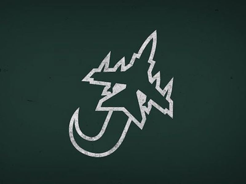
Jacksonville Jaguars
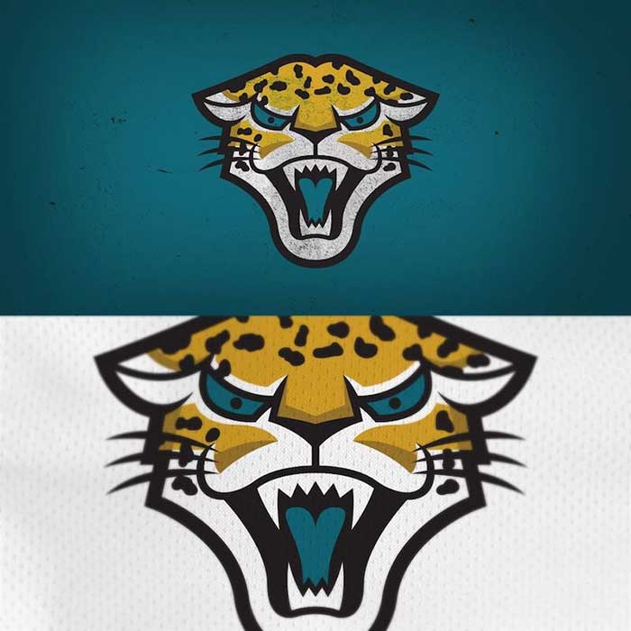
This logo redesign is a mixed bag. The front-facing cat makes for some pleasing symmetry, but there’s something about the cat that just isn’t very intimidating. There’s something about the eyes that make this cat seem more like the bad guy from a kids’ cartoon than the ferocious jungle cat it’s supposed to be.
Grade: C
Tampa Bay Buccaneers
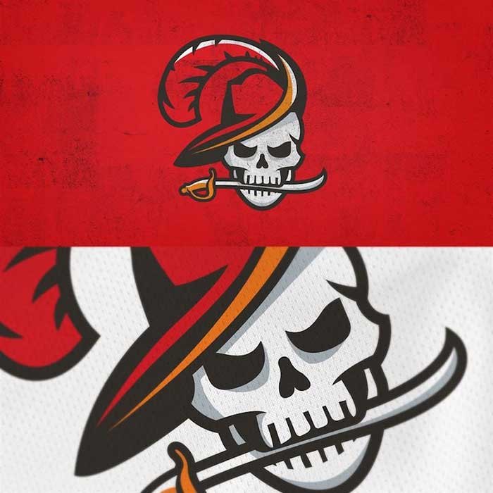
This redesign is close to perfect. They’ve taken elements from the Bucs past and combined them with their present logos. They took the skull and sword from the present logo and the feathered hat from the original handsome pirate logo. They even added accents of the old Bucs orange. Bravo.
Grade: A
Arizona Cardinals

This bird has been on an off-season diet of high-fat seeds. Look at how chunky that thing is. There’s no way it could fly. In this new Cardinals era of Kliff Kingsbury’s high-flying air attack, you don’t want your mascot to be a bird that looks it couldn’t take off from the tree branch. And what’s with that “A” in the corner? It looks out of place.
Grade: F
Los Angeles Chargers
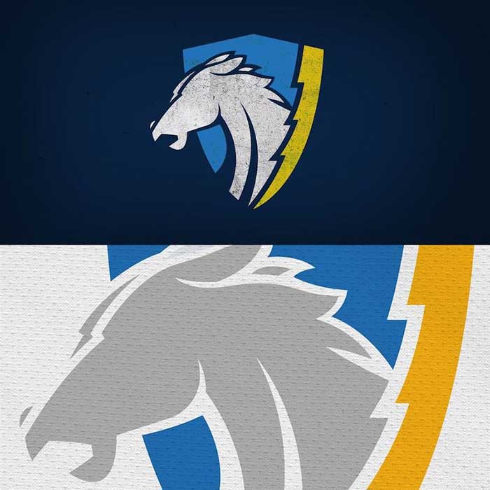
You may not realize it but this is a throwback design to the original Los Angeles Chargers logo from 1961. We love anytime a redesign incorporates the heritage of a team. It’s nice that they added the bolt along the side of the shield to keep it current. Now if only the horse had eyes.
Grade: B
Buffalo Bills

This is essentially the same logo as their current logo. The only difference appears to be this buffalo is a bit fluffier. While it might provide a soft landing for the table jumps members of the Bills Mafia are known for, it isn’t striking fear in the hearts of opponents. On the other hand, the Bills logo is one of the best in the league so there wasn’t really anywhere to go but down.
Grade: C
Los Angeles Rams

On the plus side, the symmetry is cool. Rams are incredible animals, with those tough, curved horns, but this guy looks like a cartoon character. This logo reminds you rams are basically just sheep, and no one is scared of sheep. If there was a way to make the face a little more rugged, this would be a great look.
Grade: C-
Houston Texans

At first glance, it looks a bit like the Twitter bird logo. But the longer you look at it the better it gets. The logo is minimalistic but combines many important “Texas” features. First, the colors and patterns are the Texas flag. Second, the logo is in the shape of a “T.” When you put it all together the logo looks really good.
Grade: B+
Tennessee Titans

Considering the Titans logo has never been very descriptive of what a Titan actually is, we’ll consider these an upgrade. The helmet logo is very cool and intimidating. The scythe the titan is holding is a nice touch, although traditionally the Titans logo has been a sword. Either way, this is pretty cool.
Grade: B+
Baltimore Ravens
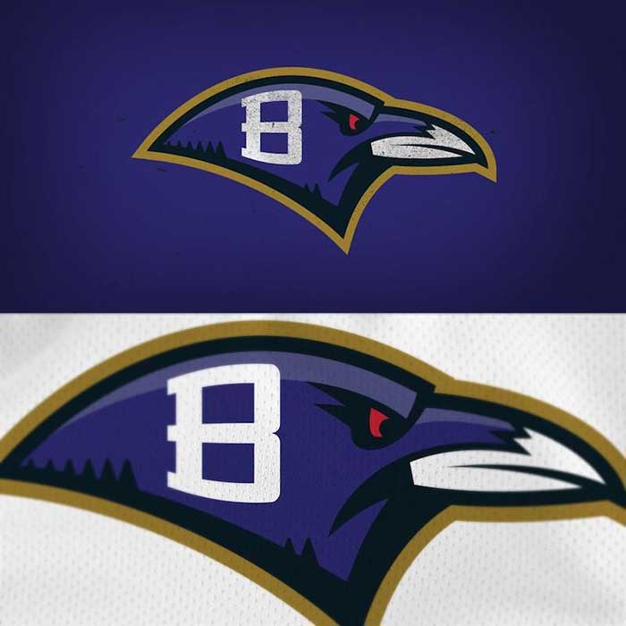
This is going to be a big nope from us. They took a pretty decent logo and made it dull. Where are the feathers, this is a bird isn’t it? What would have been really cool is if they did a forward-facing logo of the bird cawing, looking all sorts of scary. This just isn’t good enough.
Grade: D
Miami Dolphins
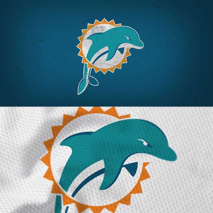
This is essentially the same logo just rounder. They took an already gentle creature and made him even softer. We get that what makes dolphins great is their intelligence, not their ferocity, but still. At least put the helmet back on the dolphin to protect its brain.
Grade: C
Kansas City Chiefs
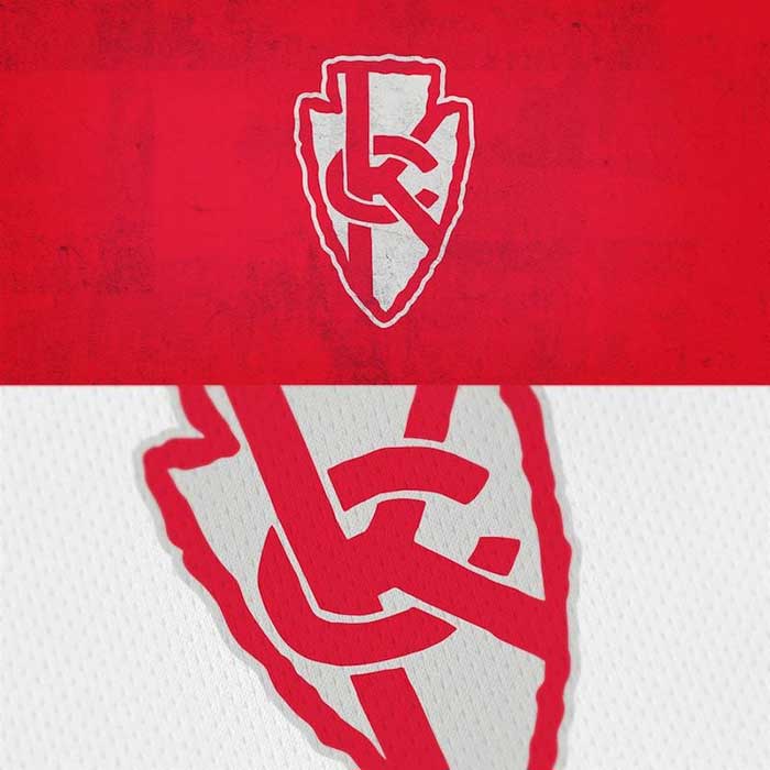
This is a mess. They took a perfect logo and complicated it. We get turning the arrowhead on its tip, that’s fine. But the confusing knot of KC in the middle is just trying too hard. Also, where’s gold? The Chiefs colors are red and gold, not red and grey. Close, but no cigar.
Grade: C+
Indianapolis Colts
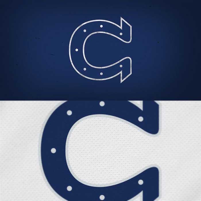
In theory, this logo is great. They took the horseshoe and turned it on its side to look like a “C” for Colts. But if they’re going to turn the horseshoe in any direction they need to just turn it upside down. Everyone knows that the points on the horseshoe should be pointing down so that the good luck flows down onto to the players.
Grade: B-
Detroit Lions

The lion has long been a heraldic symbol in the British Isles denoting royalty, so it makes sense to put the Lion logo on a shield or a crest. Only there are no monarchs in Detroit. The lion is incredibly fierce though. Good job on the design.
Grade: B+
New York Jets
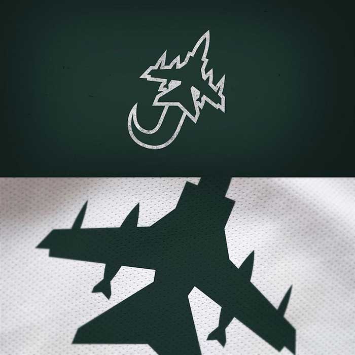
This is a winner. They used an actual jet and made a “J” out of the exhaust coming from the plane. Brilliant and simple, like all great designs. The only thing that would make this better is if there was some inclusion of New York in the logo, but for now, we’ll settle for this.
Grade: A-
Cincinnati Bengals
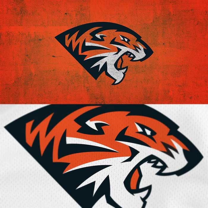
These are pretty great, although they do look pretty similar to the Nashville Predators logo. But if a logo is good, it’s good. This Bengals logo is clean and updated. We’d like to see what this designer could do with their uniforms. Those are due for an upgrade too.
Bengals: A-
New Orleans Saints
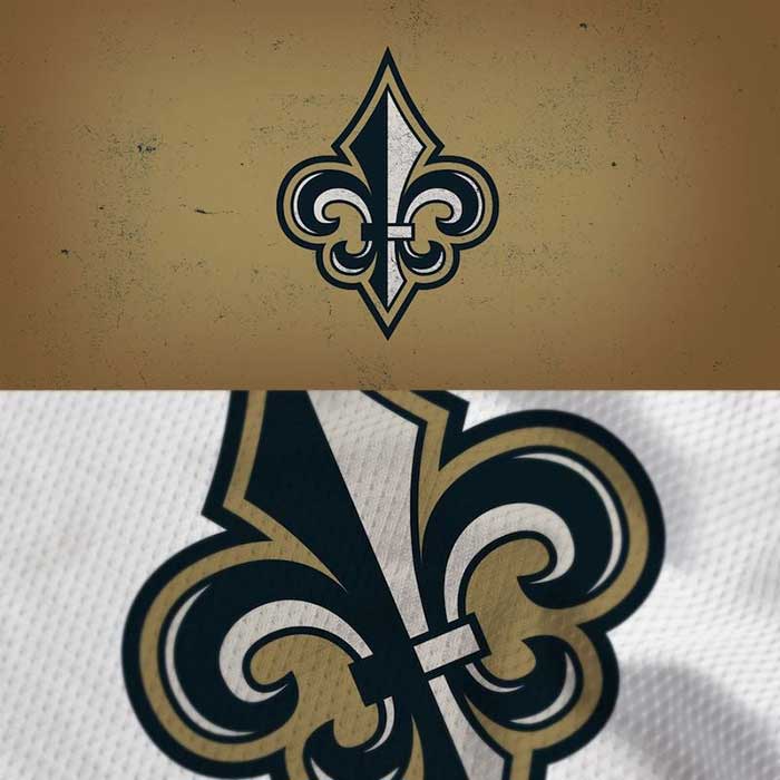
It’s the classic Saints fleur-de-lis logo, but with some added detail. It is unique in American sports to the city of New Orleans and its football team. The current logo is simple and clean, this is a bit more dramatic and colorful, just like the city itself. Very nice.
Grade: B+
Cleveland Browns

Any logo redesign for the Browns needs to begin and end with Brownie the Elf. That being said, this is pretty good. The Dawg Pound was christened in the late 1980s, and the junkyard dog has been a part of the Browns’ aesthetic ever since. This is a great re-imagining of that dog that is both modern and fun.
Grade: B+
Minnesota Vikings
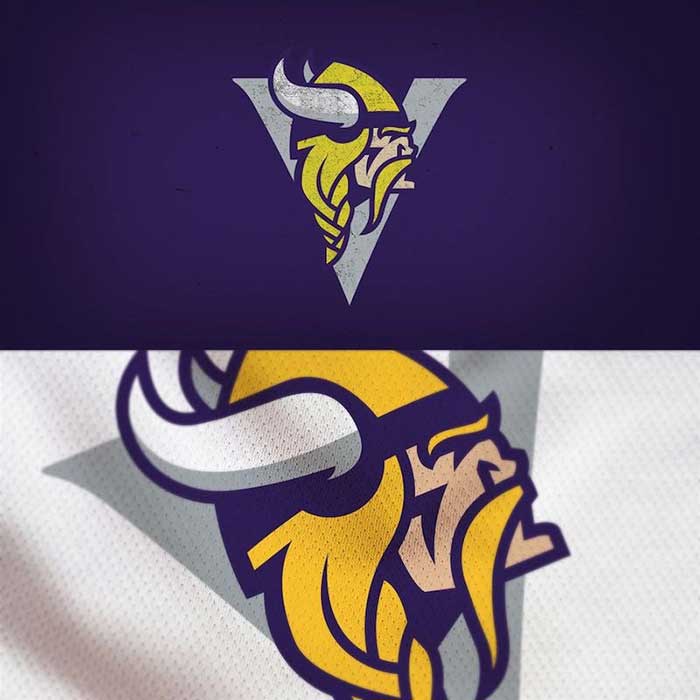
This design probably didn’t take very much time. They took the current Viking head logo and put it over top of a big, bold “V.” Sometimes the easiest solution is the best, and this is an example of that. The designer didn’t overthink it and improved on what was already working.
Grade: A-
Carolina Panthers
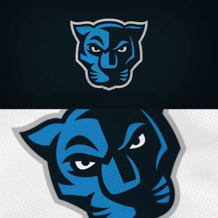
The two-tone blue and black work great together and evokes images of a panther stalking its prey through the jungle at night. Very good. The panther is missing something though, teeth. How great would this look if the panther was baring its teeth in a menacing snarl?
Grade: B+
Washington Redskins
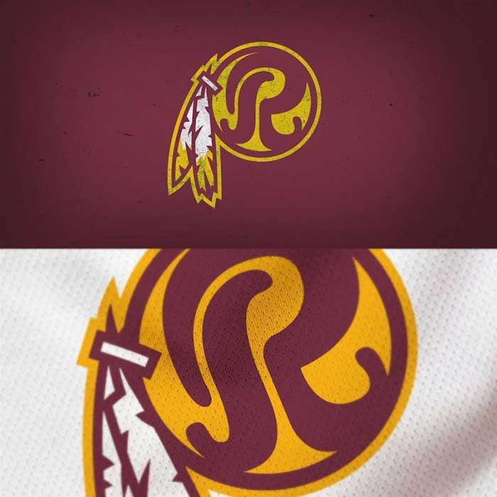
Removing the cartoon Native American from the logo is a start for a franchise stuck in a quagmire over its nickname. The curvy “R” that replaces the head looks retro but fresh. It’s a really great look. The burgundy and gold colors have always looked great together. This is a step in the right direction.
Grade: A-
Chicago Bears
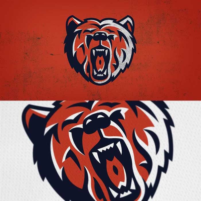
The Chicago Bears already have a front-facing bear logo, but it could use a freshening up. However, this is not the solution. It’s too busy and it’s difficult to tell where the bear’s eyes even are. To be fair, we’ve never looked a bear in the face when it’s growling like that so maybe that’s what it really looks like. In any case, we’d like to see a simplified version of this.
Grade: C+
New York Giants
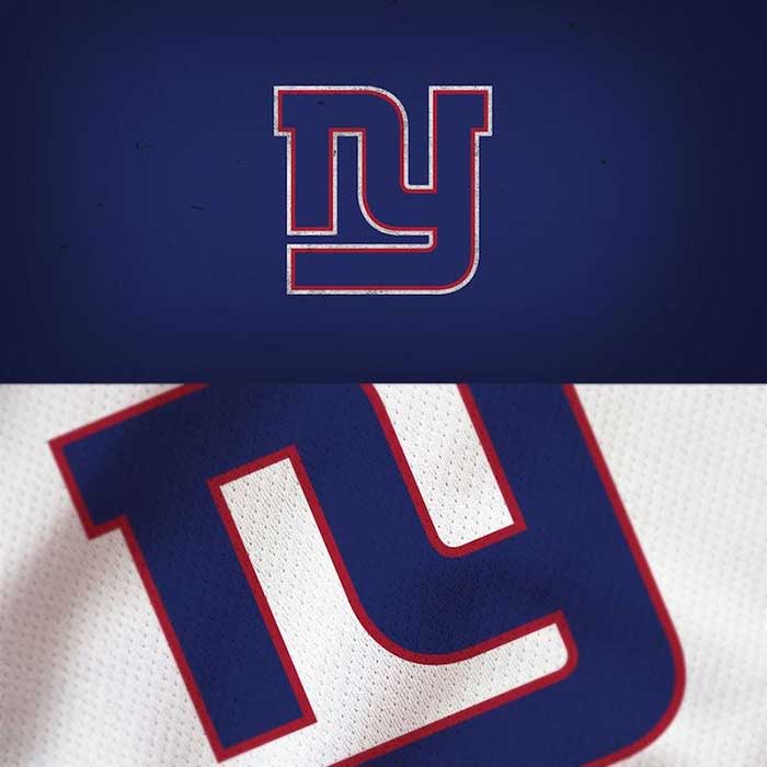
The New York Giants have been rocking their minimalist “NY” logo for a while now and it’s has worked well for the franchise. This, however, is taking minimalism too far. We can’t even tell where one letter ends and the other begins. It looks more like a diagram of the New York City subway system than two letters.
Grade: D+
Denver Broncos
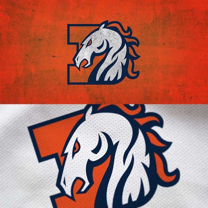
Another great example of blending the past and the present. They’ve used the orange D from the early Elway days and the modern Bronco from the late Elway days. It’s perfect. It is both retro and modern. Well done.
Grade: A
Seattle Seahawks
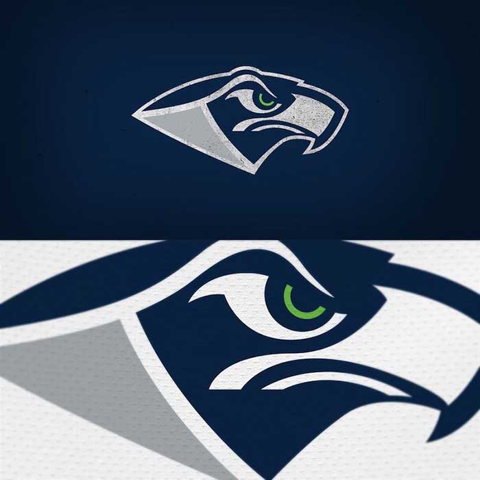
This is no good. Hawks are fearsome, sleek, birds of prey. This bird looks more like Sam Eagle from the Muppets. Like with some of the other bird logos, where are the feathers? That would be a great way to add some texture to an otherwise dull logo. Props for the raised eyebrow though, that is cool.
Grade: C-
Las Vegas Raiders
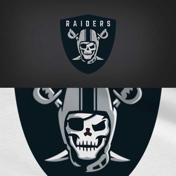
So, is the raider dead? In the original, classic Raiders logo, the raider is alive and has skin. In this redesign, the raider is a smirking skull. Apparently, the raider couldn’t handle Vegas. The skull is too reminiscent of the Buccaneers anyway. This is a no from us.
Grade: C-
Atlanta Falcons

Did you know the Falcons logo is in the shape of the letter “F”? Who knew? This redesign is essentially the same bird/letter design and it’s one of the coolest in the league so that’s fine with us. Do you see what we see? Feathers. Finally, a bird logo with feathers.
Grade: B+
Green Bay Packers

This logo may be the worst of the lot. What on earth is going on in there? It looks like the Upper Midwest version of a Celtic knot. It’s likely that there is a “G” and a “B” mixed up in there but honestly, it hurts the brain trying to decipher it. Yikes.
Grade: F
Philadelphia Eagles
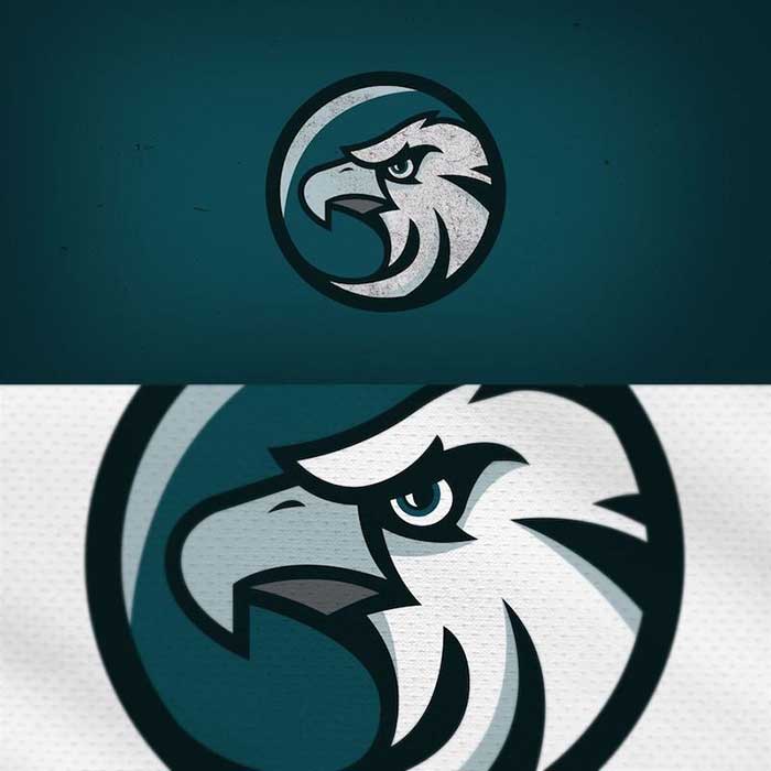
Finally, a regal looking bird. This eagle, the symbol of our country, looks confident and determined. Why the logo looks like we’re catching a glimpse of this majestic raptor through binoculars we don’t know, but it’s better than most of the other bird logos so far.
Grade: B
San Francisco 49ers
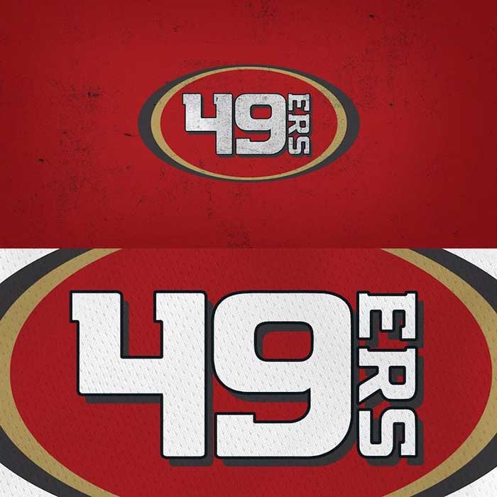
It’s difficult to modern up a logo that is literally a specific date from over 150 years ago, and this definitely isn’t doing it right. The cool thing about the Niners logo is the old-timey saloon font. At least they kept the oval logo. That’s a plus.
Grade: D
Pittsburgh Steelers
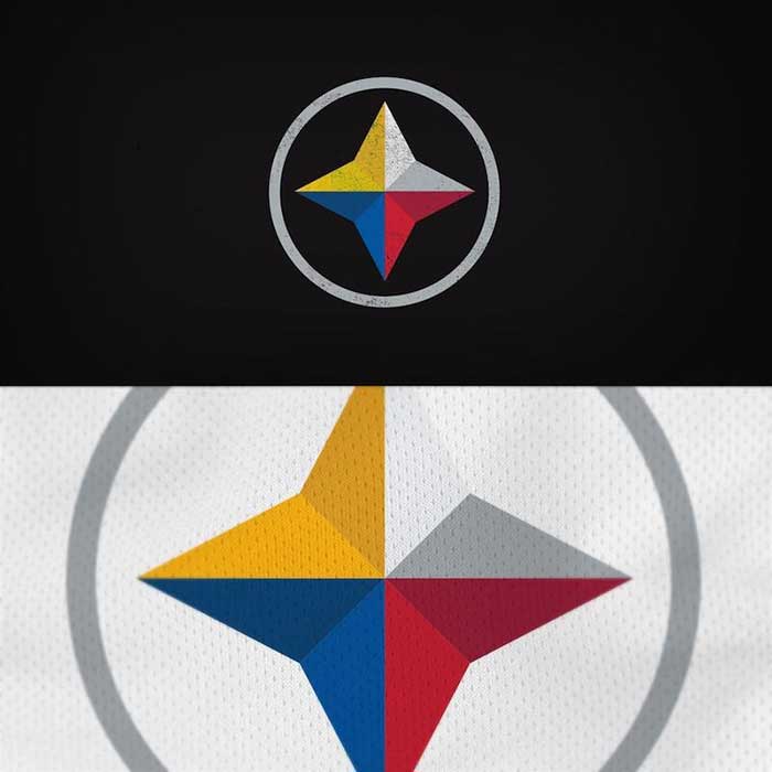
We appreciate that they’re trying to minimalize and modern up the Steelers logo, but the current logo is essentially just the Steelmark logo belonging to the American Iron and Steel Institute. To simplify the logo to anything else would be disrespectful to the heritage of the Steel City. At least they used the four-pointed star.
Grade: D+
New England Patriots
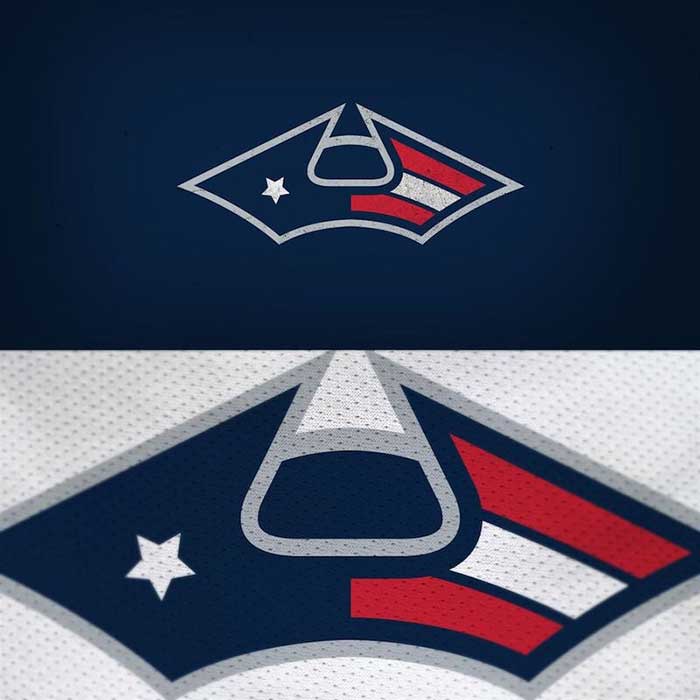
It may take you a minute to figure this one out, but this is supposed to be a front view of the tri-corned hat the soldiers wore in the days of the American Revolution. We like the nod to history and the inclusion of the star and bars, but something just isn’t working for us here. The idea is good, the execution is lacking.
Grade: C+
Dallas Cowboys

This logo is proof that often, simple is better. What says Dallas Cowboys more than a star and a “Big D”? Nothing, that’s what. The design of the “D” even has a wild west look to it. We are immediately taken to a dusty corral where cowboys tie up their horses as they roll into town. Yeehaw!
Grade: B+