Golden State Warriors
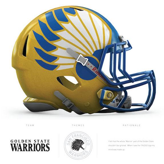
This helmet is basically the answer to what football teams with a Native American mascot should look to, if there are any issues with their present logo being considered offensive. In fact, many teams of this nature — including the Washington Redskins — have had people propose that they simply change their name to the “Warriors,” since it would be very close to the Native American heroes they’re honoring. As far as the Golden State Warriors, this helmet is in homage to the San Francisco Warriors, which the team was first known as when they moved to the San Francisco Bay area in 1962.
New York Knicks
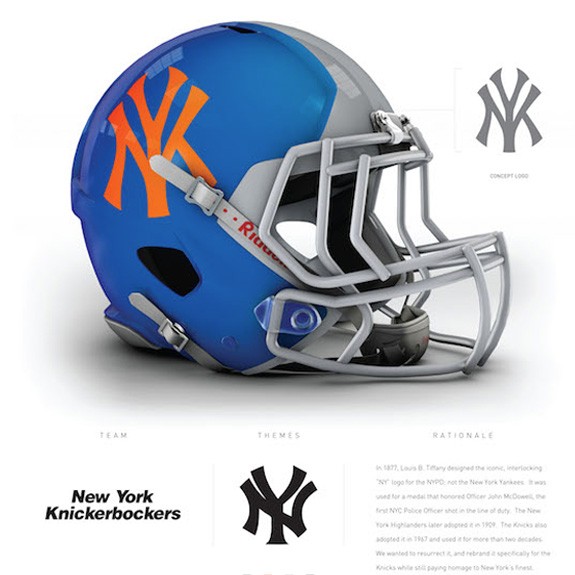
If you wanted to create a helmet that would be a bona fide “cash cow” for New York sports junkies, this would be the one. This helmet is the perfect amalgamation of Gotham’s sports teams: the blue of the New York Giants (though it’s not quite the same shade), the New York Yankees logo, and the orange accent representing the Knicks. Somebody would pay good money to purchase this helmet as a collector’s item.
Boston Celtics
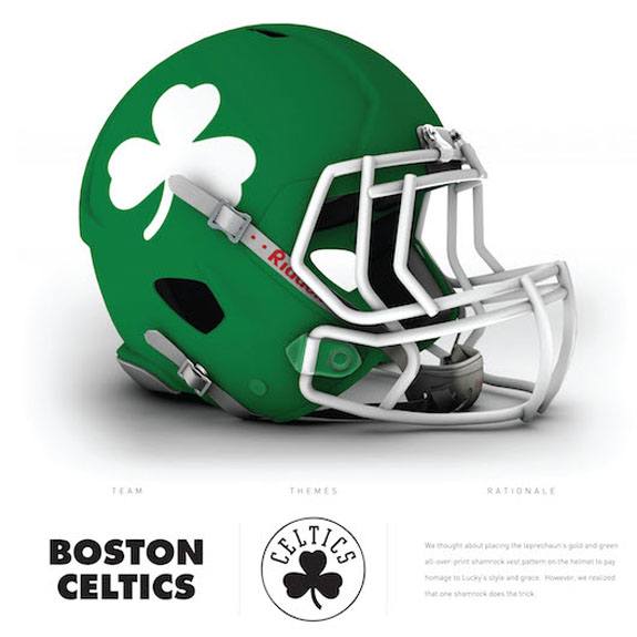
Somewhere, legendary Boston Celtics executive Red Auerbach would be smiling down from up above, if he ever saw this helmet. The green just screams “Celtic pride,” and the shamrock image on the side perfectly accentuates the Irish green color, while coinciding perfectly with the old Celtics logo also containing the shamrock.
Toronto Raptors
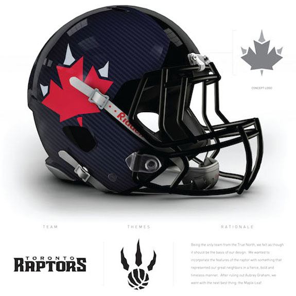
How well the merging of two key symbols on this helmet might depend on the person who’s looking at it. On one hand, the citizens of the greater Toronto area might be thrilled with the idea of having the iconic Canadian maple leaf used to represent the Toronto Raptors, especially given how the raptor claws protrude from the top of the leaf. But other people might see it as too similar to the logo of the Toronto Maple Leafs, and not immediately catch the claws concept.
Charlotte Hornets
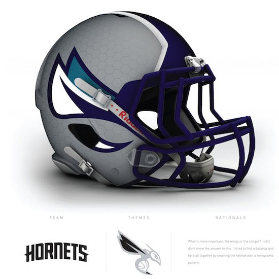
While this is an admittedly sleek helmet, you have to take a closer look at what’s going on, and juxtapose it with the context of the team it’s supposed to represent, before you fully understand it. In this case, the purple face mask clearly matches the color scheme of the Charlotte Hornets. But the graphics on the side are supposed to represent the wings of the insect, with the pointed stinger below it. The design looks a lot better with the gray background, as opposed to a teal background, though.
New Orleans Pelicans
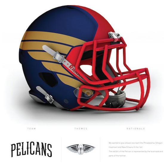
So while this is supposed to look like the golden wings of a majestic Pelican, it’s hard for us to not look at this and think it looks like the helmet for a hypothetical football team belonging to Southwest Airlines. The Pelicans have a lot blue and gold in their uniform scheme, as does this helmet, but the red facemask throws you off a bit, considering New Orleans really only uses it as an accent color on their uniform.
Phoenix Suns
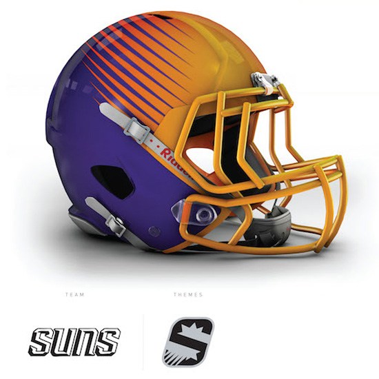
Even though purple and orange put together is a hideously clashing combination of colors, this helmet — representing the Phoenix Suns, who obviously used that color combination in their jerseys for years — pulls it off really well. The purple on the back of the helmet works really well as the overall base, while the “sunlight” and “heat rays” coming emerging from the namesake sun provide a sizzle to the helmet (no pun intended).
Sacramento Kings
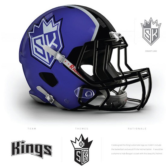
While the Sacramento Kings need to emphasize brand and team recognition as much as any team in the NBA, the logo mocked up on this helmet does a really nice job of communicating the city and team name, without having to write out “Kings” on the helmet itself. The combination of the “S” and “K” in contrasting colors, topped with a crown on top, shares similarities — without being a total copy — of the logo of the Los Angeles Kings of the NHL.
Los Angeles Lakers
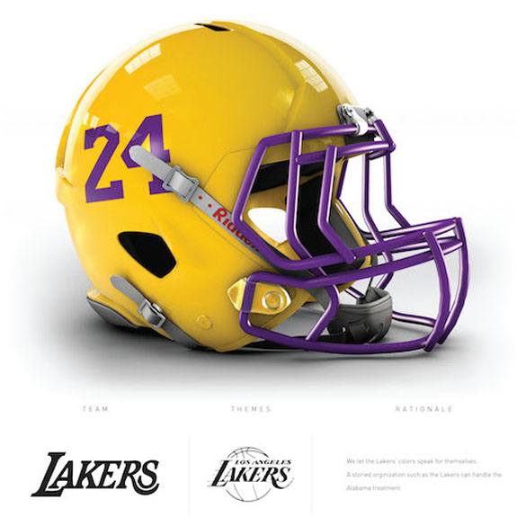
The irony of the Los Angeles Lakers, the preferred basketball of Tinseltown, having the most basic helmet with nothing but a jersey number on it, is not lost on us. It’s basically an eyesore version of the classic helmet used by the University of Alabama. However, the Lakers are one of the few franchises for which this could work, considering all the Hall of Fame players with iconic jersey numbers they’ve had suit up for them: Kareem Abdul-Jabbar (#33), Magic Johnson (#32), and Kobe Bryant (#24, as shown above). For that matter, the designer could have also selected #8, Kobe’s original number.
Detroit Pistons
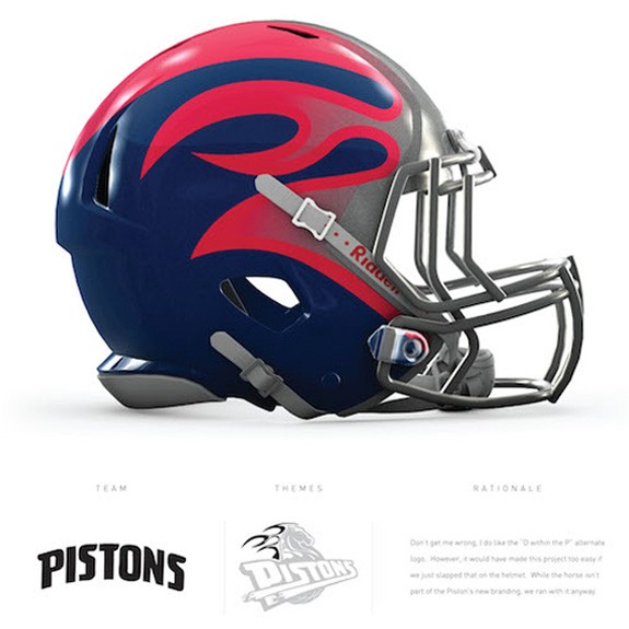
On first glance, this looks like a reimagining of the helmet of the Rhein Fire of the now-defunct NFL Europe. If you showed this helmet rendering to even the most diehard of NBA fans, they probably wouldn’t even come close to guessing that it’s for the Detroit Pistons. It was designed based off the image of the horse with the flames emerging from it, which the team first introduced in 1996 and used until 2005.
Minnesota Timberwolves
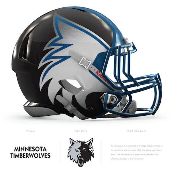
This is certainly an eye-catching way to utilize the growing wolf logo of the Minnesota Timberwolves, and creatively place it on a football helmet. The easy way would’ve just been to put the logo of the wolf itself on the side; instead, the fur coming off the Wolf’s face, which lines the sides of the helmet, replaces the wolf’s face with the players face — reinforcing the fact that they’re a member of the Timberwolves.
San Antonio Spurs
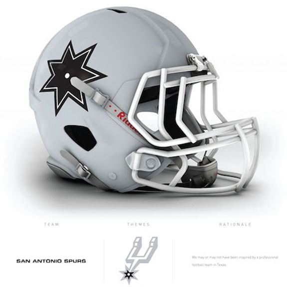
The San Antonio Spurs have built a two-plus decade legacy on keeping things simple, classic, and extremely well-executed. This helmet is an exact manifestation of that. The gray helmet is a perfect “blank canvas” for the simple star on the bottom of the spur. It’s a great allusion to the star on the helmet of the Dallas Cowboys as well.
Memphis Grizzlies
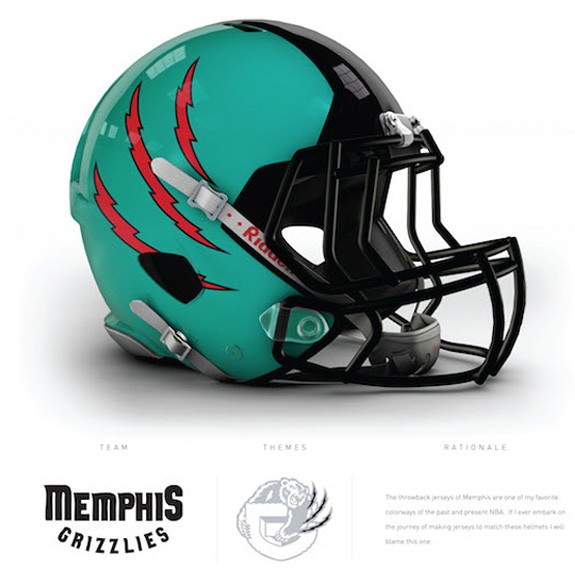
Last time we checked, there weren’t a lot of Grizzly Bear attacks, or Grizzly Bears in general, in the Barbeque-and-Blues-filled city of Memphis. But, that’s what happens when you have a franchise start out in one city (Vancouver) and move to a totally different city later on (Memphis). The three claw marks across the helmet represent the hypothetical attack of a grizzly bear nonetheless. The color scheme of this helmet is based on the original turquoise, bronze and red color combination of the Vancouver Grizzlies.
Denver Nuggets
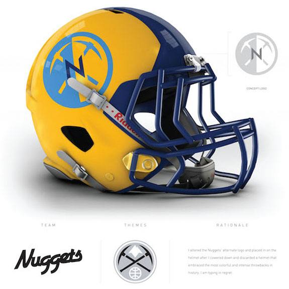
This might be one of the most well-executed helmet designs of them all. If not done well, the color combination of navy blue, yellow gold, and light blue could get really busy. Yet this was designed by taking current Nuggets logo, with the two pickaxes, and placing a sleek “N” in the middle of that adapted logo, while gracefully utilizing all three colors along the helmet.
Utah Jazz
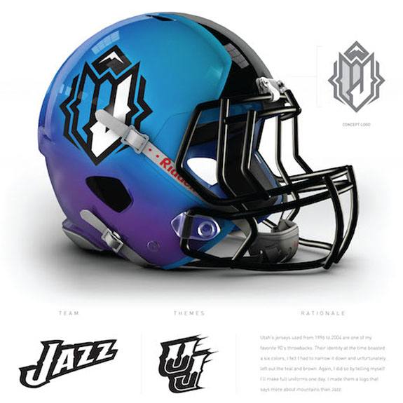
This is another one of those helmets where you could give even the most devoted NBA fans a few guesses, and they still might get it wrong. This was supposed to artfully combine a “U” and “J” with the blue and purple color scheme used by the team between 1996 and 2004. However, it just looks like one of those designs which you used to see skater kids sketch on their notebooks.
Oklahoma City Thunder
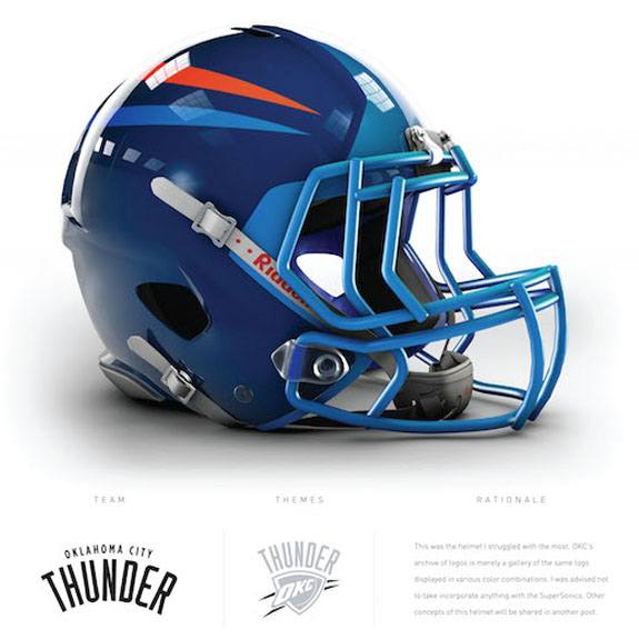
Of all the interesting designs morphed from NBA logos onto football helmets, this might be the most plain and indistinguishable one. Sure, the helmet contains the two orange and blue “energy bolts” that are seen on the logo of the Oklahoma City Thunder. But honestly, how many people would’ve recognized that? They probably should have put the “OKC” letters from the logo on the helmet as well.
Cleveland Cavaliers
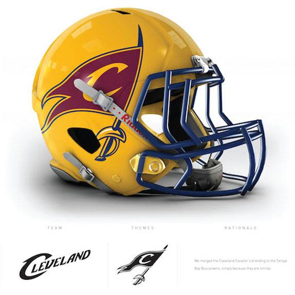
The definition of a Cavalier is “a horseman, especially a mounted soldier.” But the way that the logo of the Cleveland Cavaliers has been designed on the helmet, it looks more like a pirate’s flag. Or, put another way: it looks more like a Buccaneer, and more specifically, very similar to the helmet design of the Tampa Bay Buccaneers.
Portland Trail Blazers
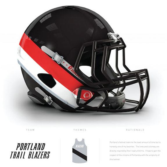
The design for this helmet was based on the Portland Trail Blazers jersey design, featuring an all red jersey with a large black stripe across it. While the colors of the helmet make the team it’s representing fairly distinguishable, there was probably more they could have done to utilize the actual Trail Blazers logo itself. Otherwise, the helmet looks rather plain.
Miami Heat
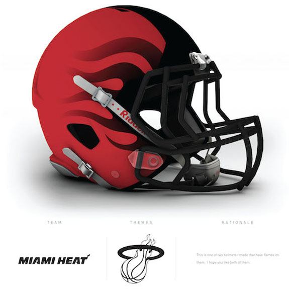
When it comes to utilizing flames on a helmet, this one works so much better (as opposed to the design for the Pistons). After all, the team name is the “Miami Heat,” and if you look closely, there are flames coming off the basketball on the team’s logo. Plus, the red and black not only matches well with the overall concept of fire, but also with the team’s color scheme in general.
Atlanta Hawks
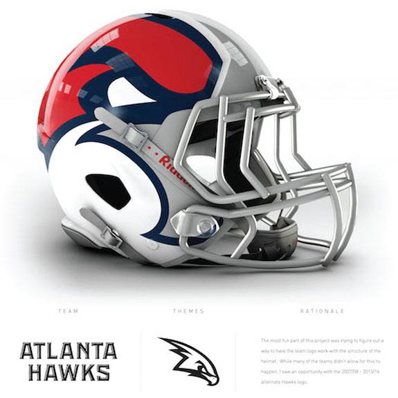
Once you know what you’re looking at, as far as this helmet, it actually looks pretty cool. Drawing inspiration from the alternate logo that the Atlanta Hawks used between 2007 and 20014, the helmet represents a front-facing hawk, with its two eyes right above the top corners of the face mask. The amount of white and gray on the helmet might be a bit misleading, but it comes from the beak of the referenced alternate logo.
Dallas Mavericks
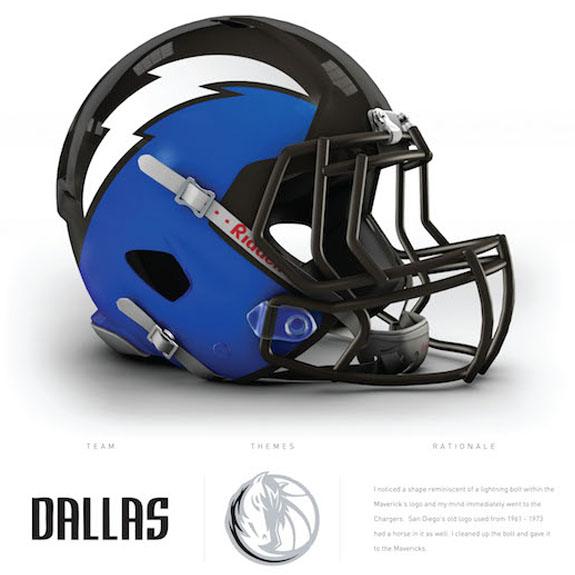
The idea for this logo came from the jagged stripe leading up to the horse’s hair on the logo of the Dallas Mavericks. But when playing with said strip and trying to use it for the purposes of a football helmet, it ended up looking like the Los Angeles Chargers ended up having a love child made from the colors of the Mavericks logo. It’s a cool idea, but it’s just too similar to one that already exists in the NFL.
Washington Wizards

We get the idea of putting the all-American colors of red, white, and blue on the helmet representing Washington, DC’s basketball team, especially given that the Washington Wizards changed to that color scheme in 2011. The biggest problem that anyone from the Washington, DC-are would have is seeing a star on the middle of the helmet. Football fans in the DC area hate the Dallas Cowboys more than any other team in the NFL, and having a helmet with a star on it would definitely not sit well with them.
Houston Rockets

When the Houston Rockets changed their logo to the word “Rockets” above a basketball, and an actual missile-looking rocket on top of the ball, most people probably missed the eye on the shark-looking snarl at the top of the rocket. So while this helmet would appear to have nothing to do with a rocket, or Houston’s color scheme, on first glance, it’s actually a really creative way to showcase the team’s logo.
Orlando Magic
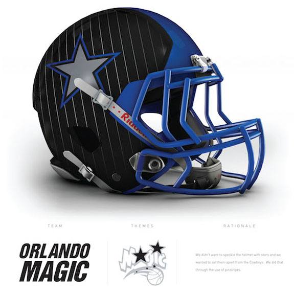
It would make the most sentence to showcase the shape of a star on this logo, as the concept of this helmet was based on the Orlando Magic’s logo from when they first entered the league in 1985. In that logo, the second “O” in Orlando and the “a” in Magic were both replaced with stars. But again, because of the way the star was utilized on this helmet, it just too-closely resembles the helmet of the Dallas Cowboys, especially when you integrate the blue into it.
Milwaukee Bucks
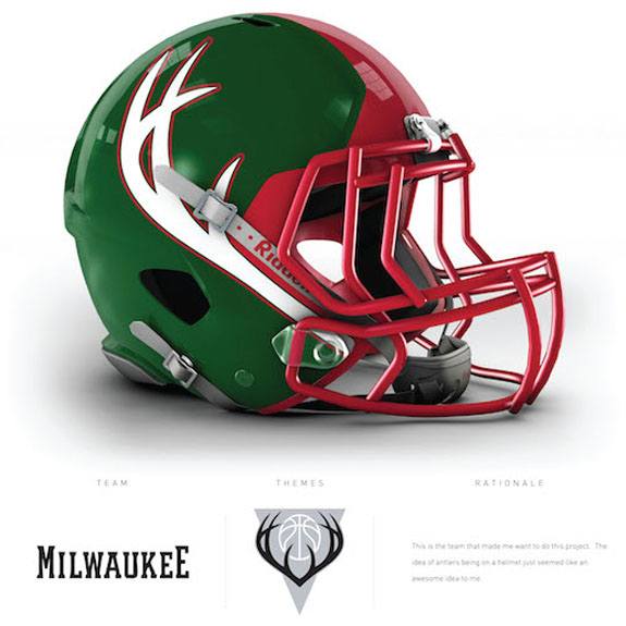
When you try and use the combination of green, red, and the symbol of deer antlers, you run the risk of turning your design into a Christmas-themed creation. But with this helmet version for the Milwaukee Bucks, there was no such issue. The way the helmet utilizes one primary color, a second color accent down the top of the helmet, and creatively angling the antlers of the “Buck” deer was actually done rather gracefully.
Indiana Pacers
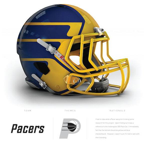
We think this helmet design for the Indiana Pacers actually brings some on-field “sizzle” to a logo that’s not really all that captivating. This helmet does a really good job portraying “speed,” which the “Pacer” should be known for (the Pacer is in reference to the Pace Car at the Indianapolis 500 race). The yellow trim atop the blue-colored helmet is also very eye catching, and the different elements show up much better on the helmet than they may on the logo itself.
Chicago Bulls
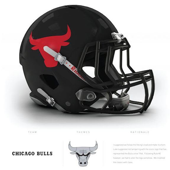
As simple as this one maybe, it’s actually one of our favorite mashup helmets. The Chicago Bears helmet is known for being almost entirely dark navy blue, with the orange colored “C” on the side. In this case, the all-black helmet with the silhouette of a Bull, representing the Chicago Bulls, is a simple but cool transition. And while the Bull on the helmet doesn’t have any design on the logo itself, it looks really similar to the traditional “Brahma Bull” tattoo on the arm of Dwayne “The Rock” Johnson.
Los Angeles Clippers
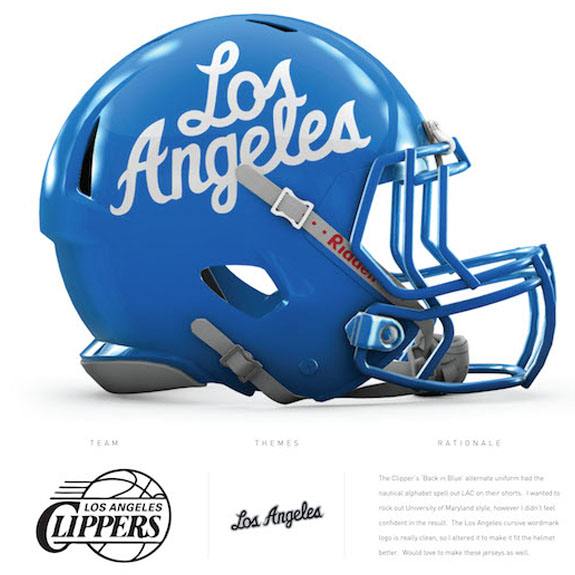
During the brief fad when teams were introducing jerseys that had half sleeves, the Los Angeles Clippers introduced a powder blue version that had the words “Los Angeles” written in cursive across the front. As you might imagine, that’s directly where this jersey came from. On the jersey itself, the city name had a bit of a red trim around each letter, which might have been a nice touch to this otherwise blue-and-white sky-looking helmet.
Brooklyn Nets
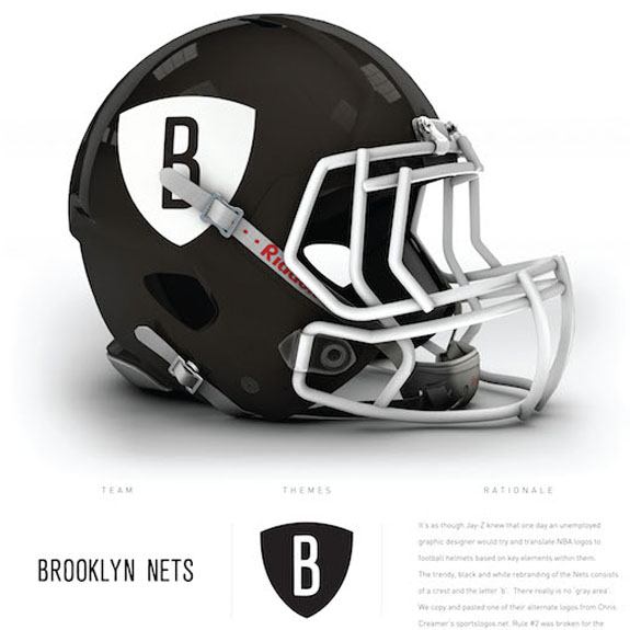
There’s a reason the saying “If it ain’t broke, don’t fix it” exists. The rendition of the Brooklyn Nets uniform into a football helmet is best described by that saying. The black-and-white uniform with the “B” on a shield already does a simple but clean job, in terms of serving as the logo and color scheme for the new iteration of the Nets. So while this is a direct translation of said logo, it works just fine.
Philadelphia 76ers
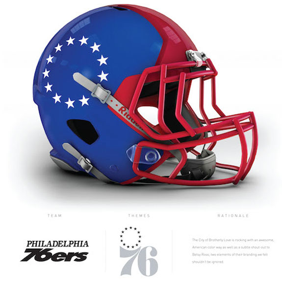
We’ve saved our very favorite one for last. If the Summer Olympics ever made American football one of the Olympic sports, this is exactly what we would imagine that Team USA could — or should — wear as their uniforms. Of course, this jersey is the representation of the Philadelphia 76ers, who happen to play in the birthplace of American independence. Naturally, the ring representing the 13 original colonies does a magnificent job on the side of this All-American helmet.